σχεδιασμός eshop

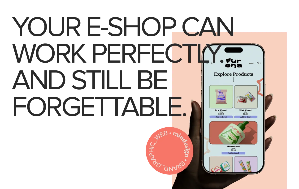
E-shop design: It works. But does anyone remember it?

The e-shop design does not end when the online store opens and starts operating. The products are added to the cart, the payment is completed, and you say: “Great, we’re ready.”

But are we?

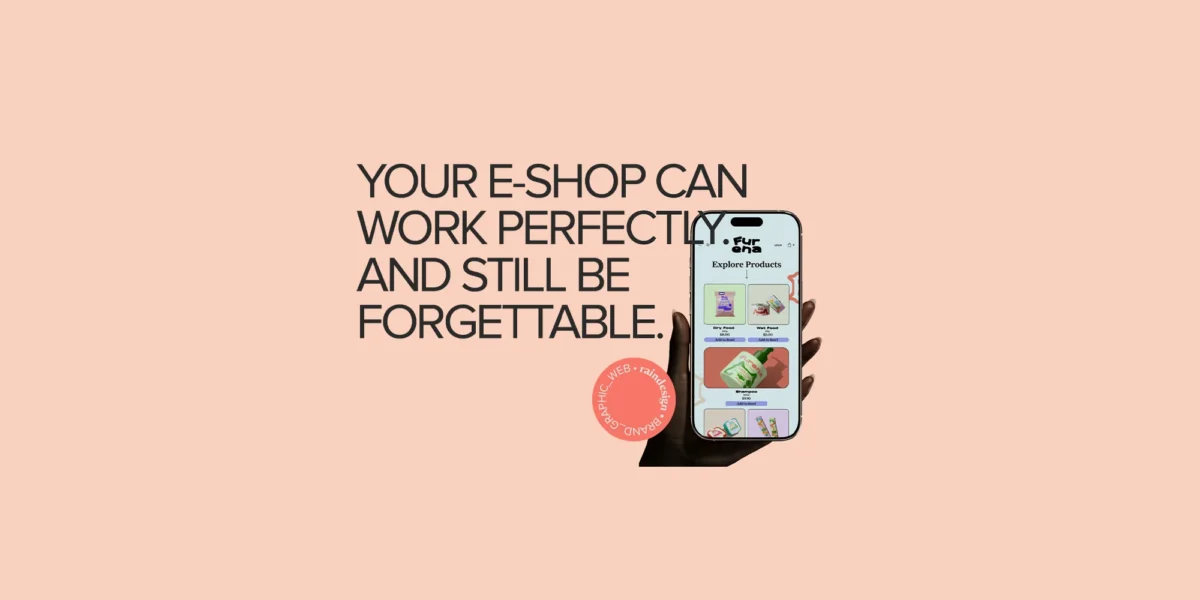
Because an e-shop that works is one thing, and an e-shop that makes you stop, trust the brand and, most importantly, remember it after closing the page is another.

The e-shop development naturally has an important technical aspect. It requires proper functionality, speed, secure payments and a good experience on mobile and desktop. However, when the online store looks like dozens of others, technical excellence alone is not enough to create a distinctive image.
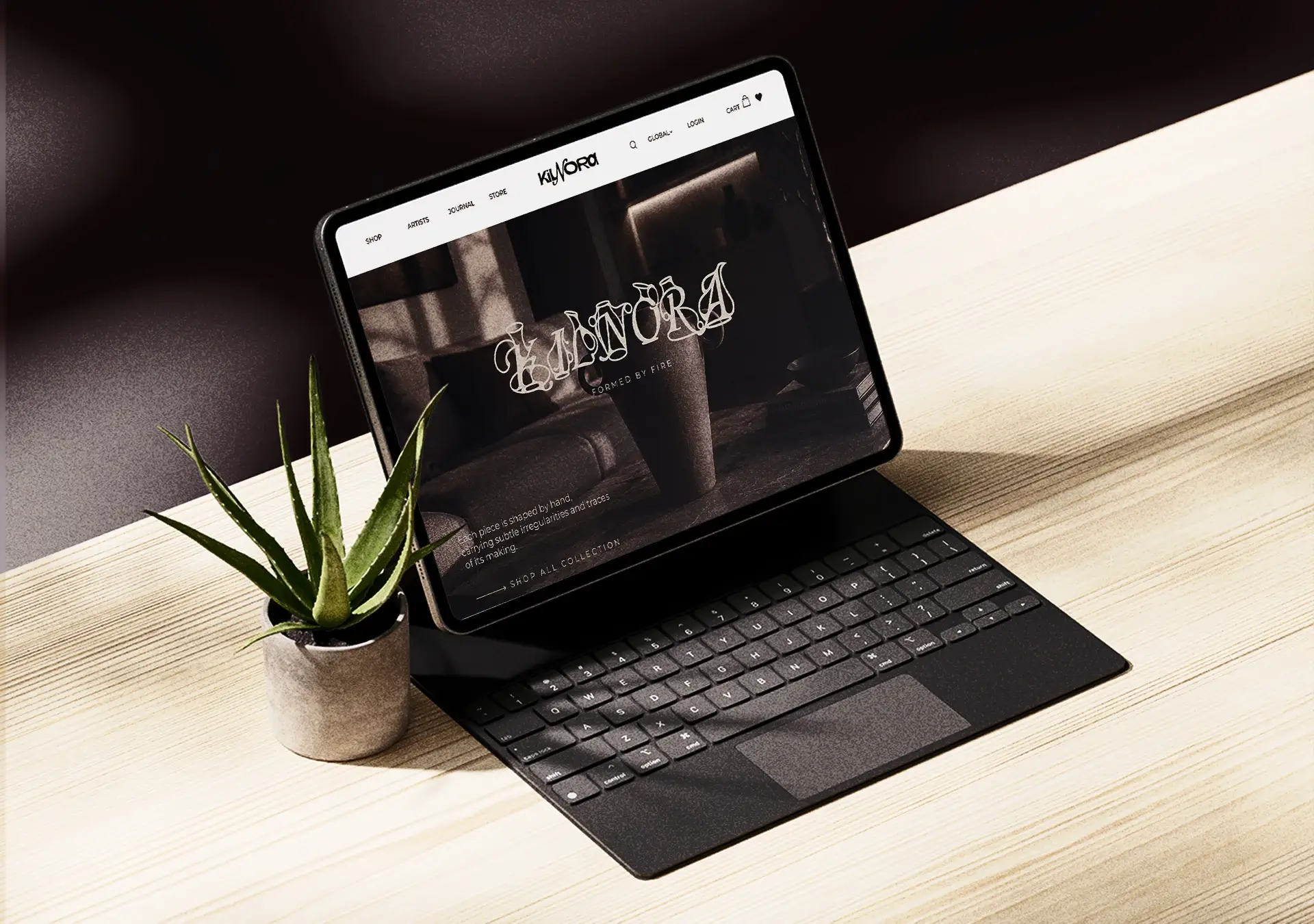
An e-shop that works can still be unremarkable

This is where the problem with many online stores lies.

They are not necessarily unattractive. They are simply… the same.

The same template, the same layout, the same large banners, the same buttons and similar product photos on a white background. The logo in the top left changes, and we think we have changed the brand. It doesn’t quite work like that.

A logo cannot give character to an entire e-shop on its own. There needs to be a clear direction in the way the products are presented, the photography, the colours, the typography and the small details of the experience.

The customer is not only buying the product

Let’s say you sell handmade cosmetics. The customer can find similar products in dozens of other e-shops. If your website gives them no reason to distinguish you from the rest, then their decision will be based mainly on price. And you do not want to compete solely on price all the time.

The aesthetics, photography, packaging, copy and the way you present the products create a specific feeling around the brand.

They are essentially telling the visitor:

“This is who we are. This is how we want you to perceive us.”

However, if all these elements do not share a common direction, the customer simply sees products. They do not see a brand.
A beautiful template is not e-shop design

“I found a really beautiful template. Can’t we use it as it is?” We can. Just as we can buy the same jacket worn by two hundred other people. That does not mean we have automatically developed a personal style.

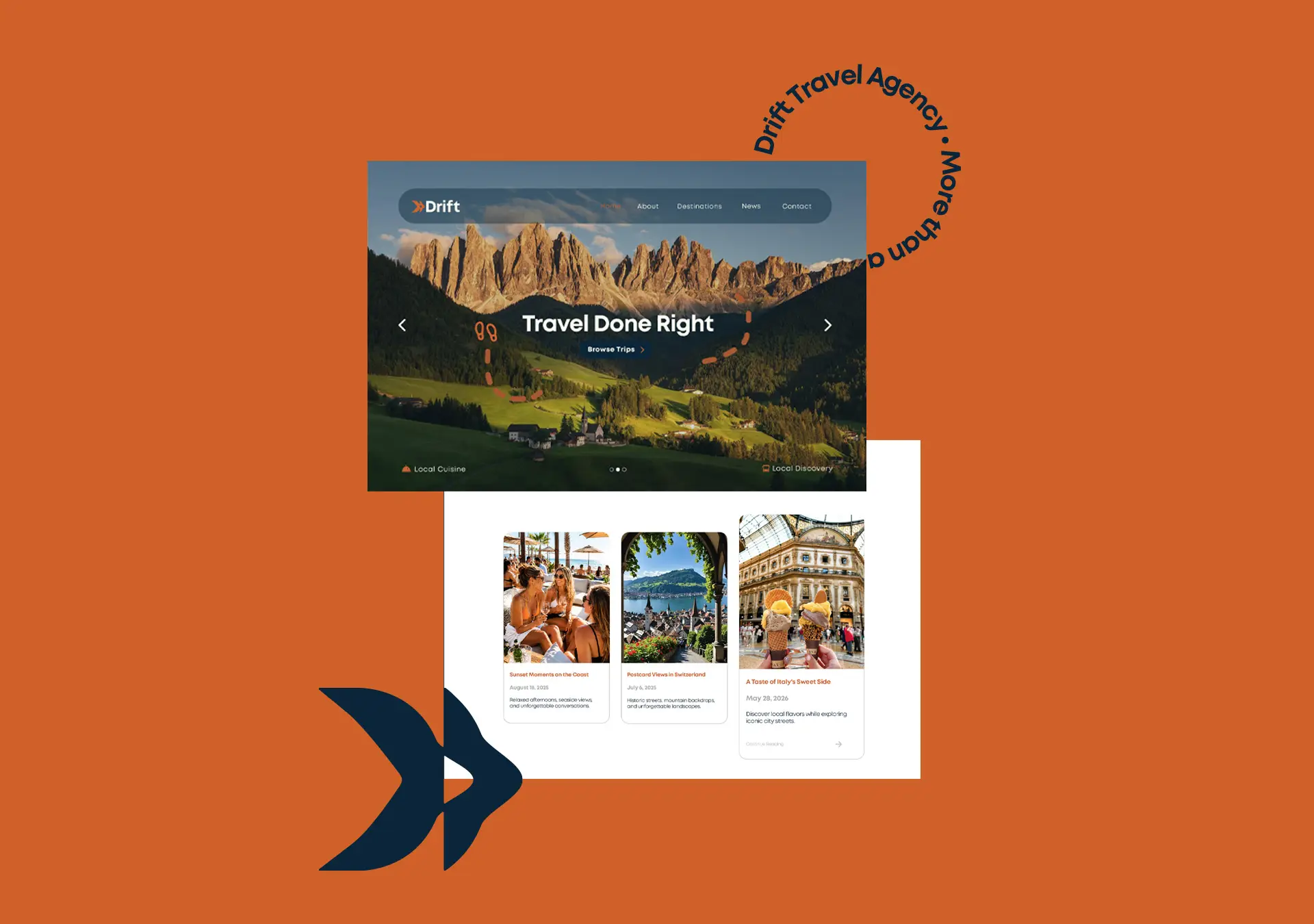
The template is a starting point. It is not the complete identity of the online store. It needs to be adapted to the brand, the products, the audience and the way you want to present your business. Otherwise, the e-shop may look modern and polished, but it could belong to anyone.

And when a brand could be any brand, it is difficult for it to become recognisable.

The homepage is not a product catalogue

The homepage is the first “welcome”. It does not need to display everything you sell, every category, every offer and anything else we managed to fit in from the very beginning. First, it needs to create an atmosphere and help the visitor understand where they are.

→ What is the brand?
→ What makes it different?
→ Who is it aimed at?
→ Why should I keep looking?

If the visitor immediately sees twenty products, three pop-ups and a huge red “-30%” sign, the message they receive is not necessarily “look how many options I have”.

It may simply be: “Where should I look first?”

Photography is not added at the end

Photography is often treated as the last thing to be added once everything else is ready. However, in an e-shop, photography is a major part of the design.

It is not enough for each product to have a clear photograph. All images need to share a consistent style, lighting, colour direction and presentation.

A complete collection of photographic material may include:

→ clear product photographs,
→ close-up detail shots,
→ photographs of the product in use,
→ images that create the brand’s atmosphere,
→ material designed for banners and different screen ratios.

When the images look as though they come from five different businesses, no design can truly bring them together.

Identity is revealed in the small details

A recognisable e-shop is not built with just a large logo and two brand colours.

Its identity is revealed:

→ in the way the headings are written,
→ in the choice of fonts,
→ in the buttons,
→ in the product cards,
→ in the icons,
→ on each product page,
→ in the filters and categories,
→ in the checkout messages,
→ in the confirmation email,
→ even in the way it announces that a product is out of stock.

These elements may seem small, but together they create the experience. And it is the experience that makes a customer say: “Oh, yes. I remember this brand.

The e-shop should be a continuation of the brand

The website, the packaging, the social media and the product itself are not separate things. They are different touchpoints with the same business.

The customer may discover you on Instagram, visit the e-shop, receive the product and later open one of your newsletters. At every stage, they should feel that they are in the same world. Instagram cannot have one aesthetic, the e-shop a second, the packaging a third, and the newsletter look as though it was sent by a completely different business.

Consistency does not mean that everything must be identical. It means that everything should come from the same design foundation.

E-shop design and development: form and function together

The design and technical development of an e-shop have different roles, but they need to work together.

The design determines:

  • the visual direction,
  • the content hierarchy,
  • the visitor’s journey,
  • the presentation of the products,
  • consistency with the brand.

Technical development ensures that all these elements function correctly, quickly and securely on every device. Without functionality, the e-shop makes things difficult for the customer. Without design, the e-shop may function but fail to leave any distinctive impression.

See how we approach website and e-shop design and development, with an emphasis on consistency, structure and the brand’s image.

In the end, what should the customer remember?

Not necessarily the colour of a button or the exact position of a photograph.

They should remember the feeling.

→ That the e-shop was thoughtfully designed.
→ That they quickly understood what it offers.
→ That they trusted the business.
→ That the visual identity had character.
→ That they would want to return.

A functional e-shop can complete a purchase. A thoughtfully designed e-shop, however, can build trust, recognition and a customer who will return.

And that is where the real difference lies.

Are you thinking of creating or refreshing your e-shop?

Let’s design an e-shop that doesn’t simply work well, but expresses your brand!

Call us or send us an email

Built right. Work with us.