ZUKAE
BRAND IDENTITY / LOGO DESIGN / PACKAGING DESIGN / VISUAL COMMUNICATION Asian restaurant corporate identity design / Asian restaurant logo design / Packaging design / Posters and social media applications
Asian restaurant corporate identity design Asian restaurant logo design Packaging design Posters and social media applications
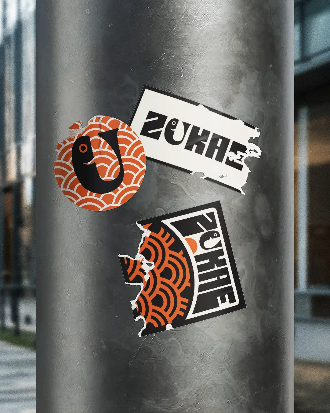
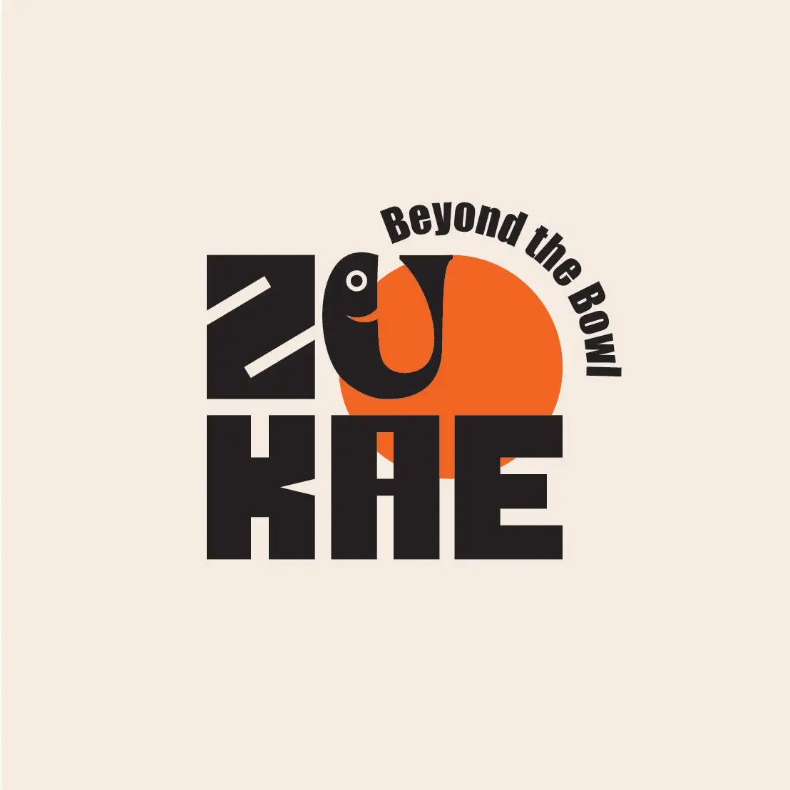
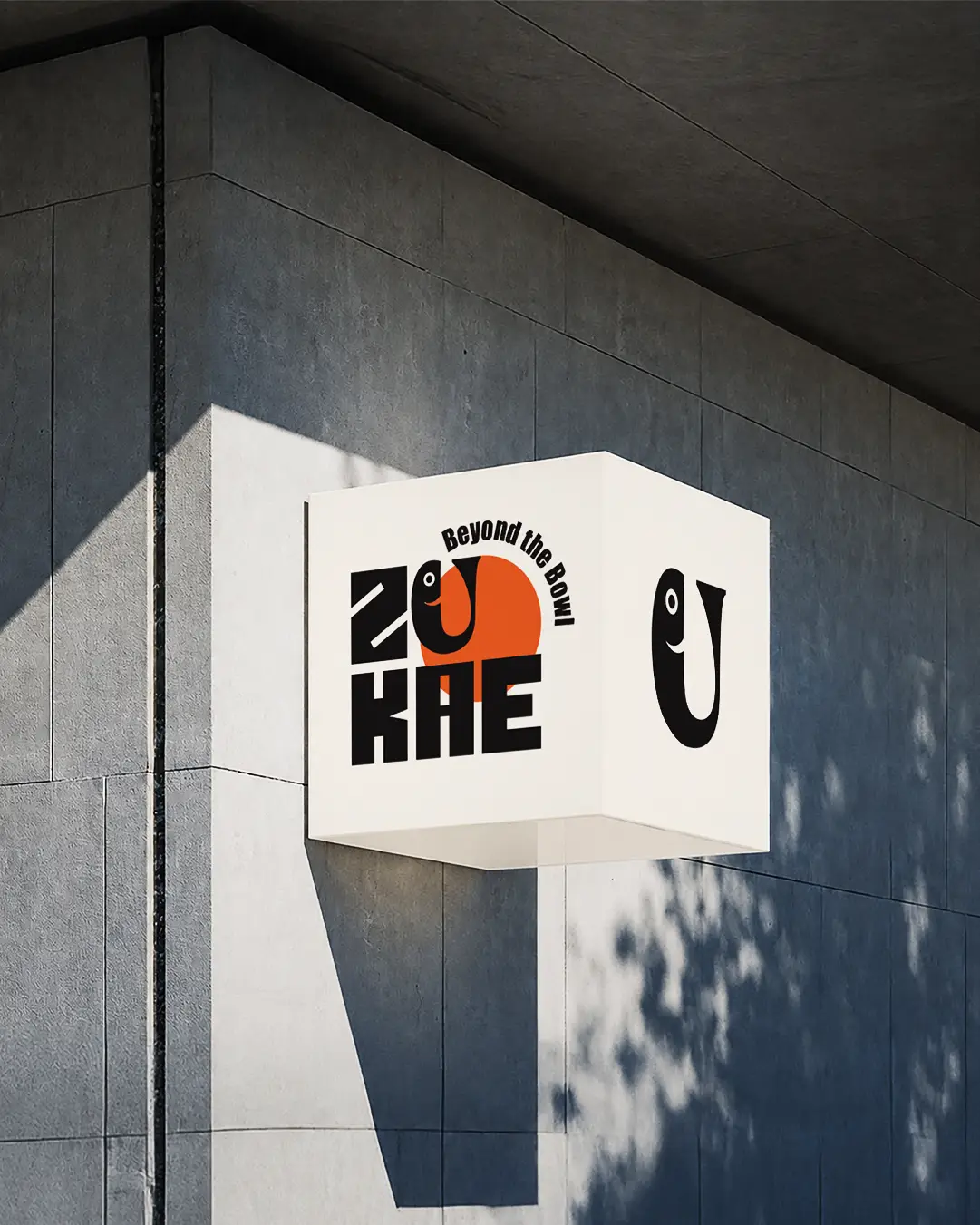
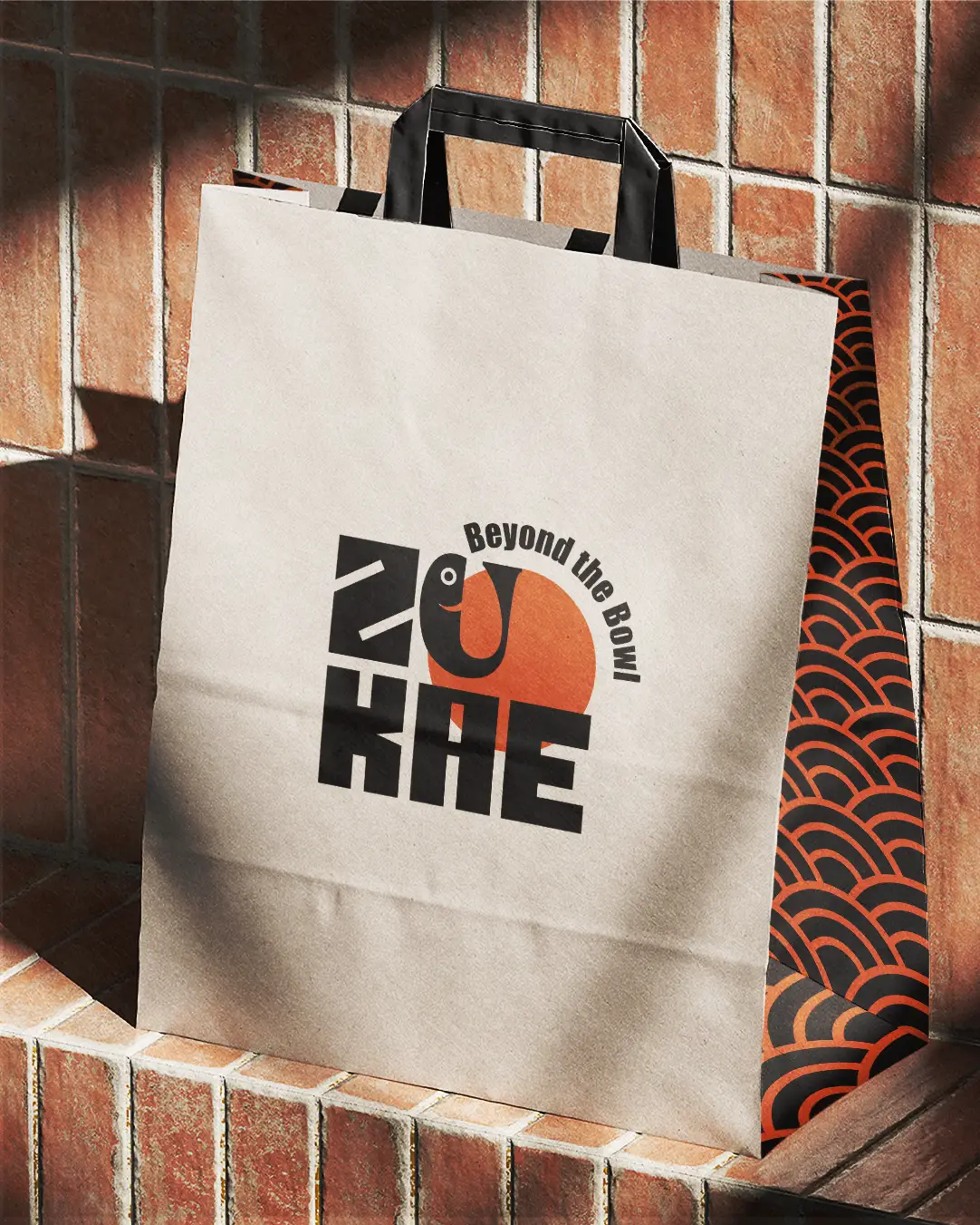
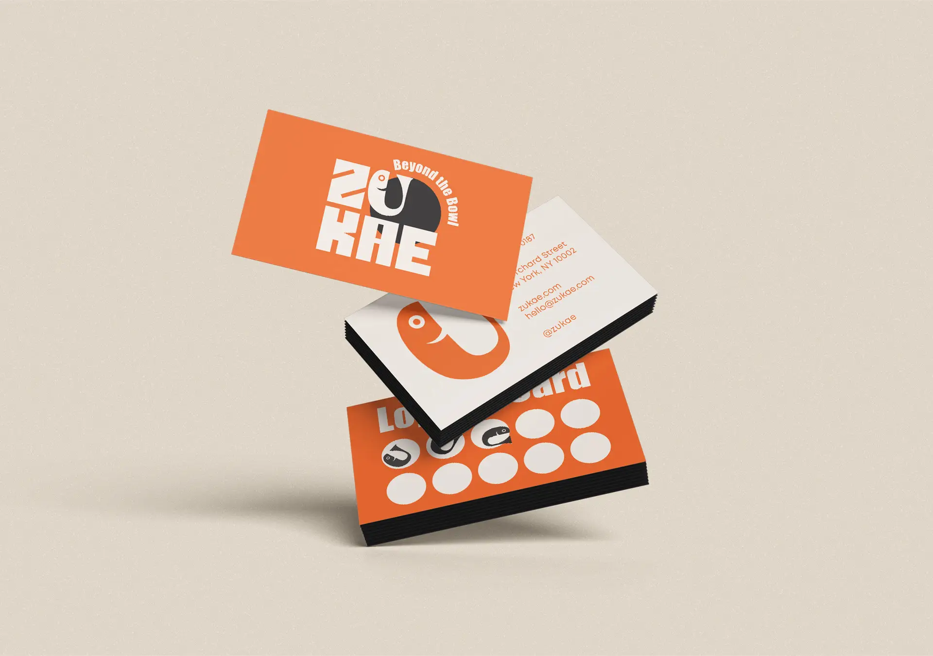
ZUKAE is a modern Asian eatery with an identity based on distinctive elements of Asian cuisine, presented in a contemporary, clean, and instantly recognizable way. The central focus of the design is the logo. The bold, solid typography creates a dynamic image, while the letter U is transformed into a minimal fish symbol. This element directly connects the brand with Asian gastronomy, while also serving as a distinctive symbol of the identity.

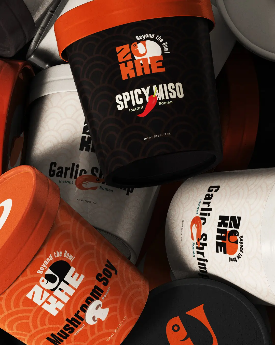
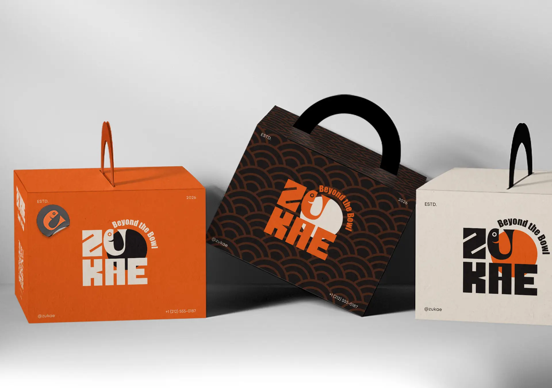
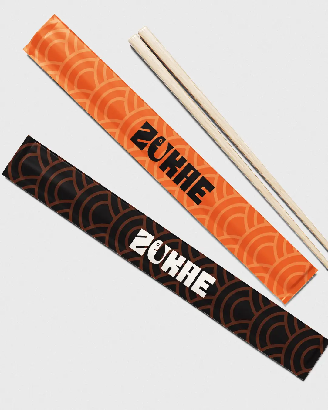
The same design approach continues throughout the pattern. The repeating curves are reminiscent of both traditional Asian patterns and noodle lines, creating a connection to food without using literal imagery. The pattern is applied to packaging, bags, chopsticks, stickers, and individual graphic details, creating consistency even across the smallest applications.
The palette of orange, black, and warm neutral tones enhances the brand’s bold and vibrant character. Orange evokes the warmth, flavour, and energy of the cuisine, while black provides contrast and makes the logo stand out instantly.
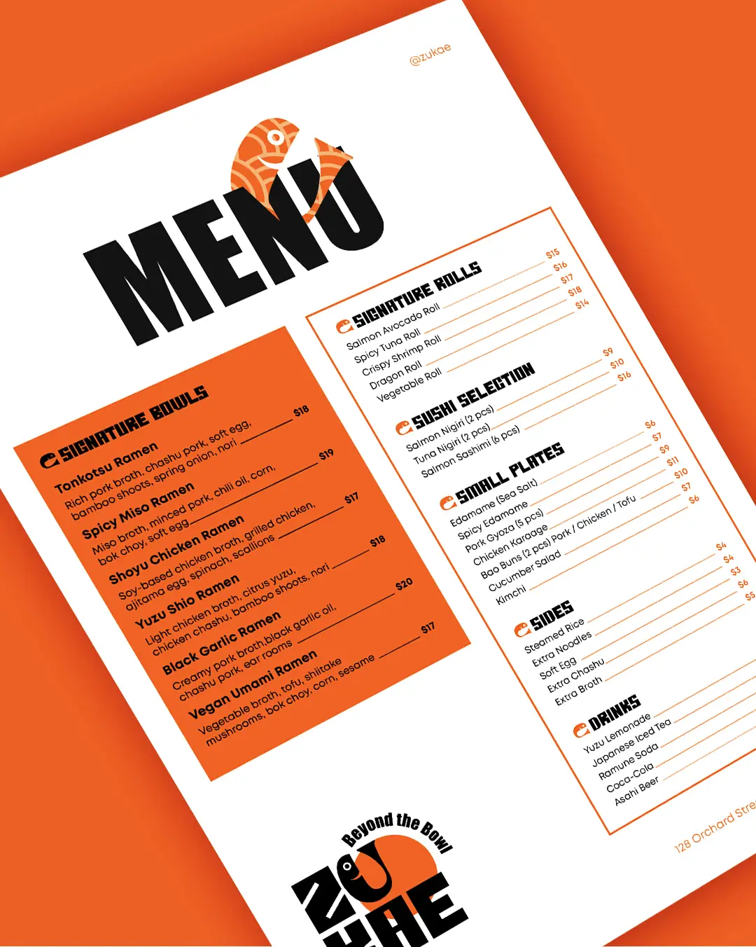
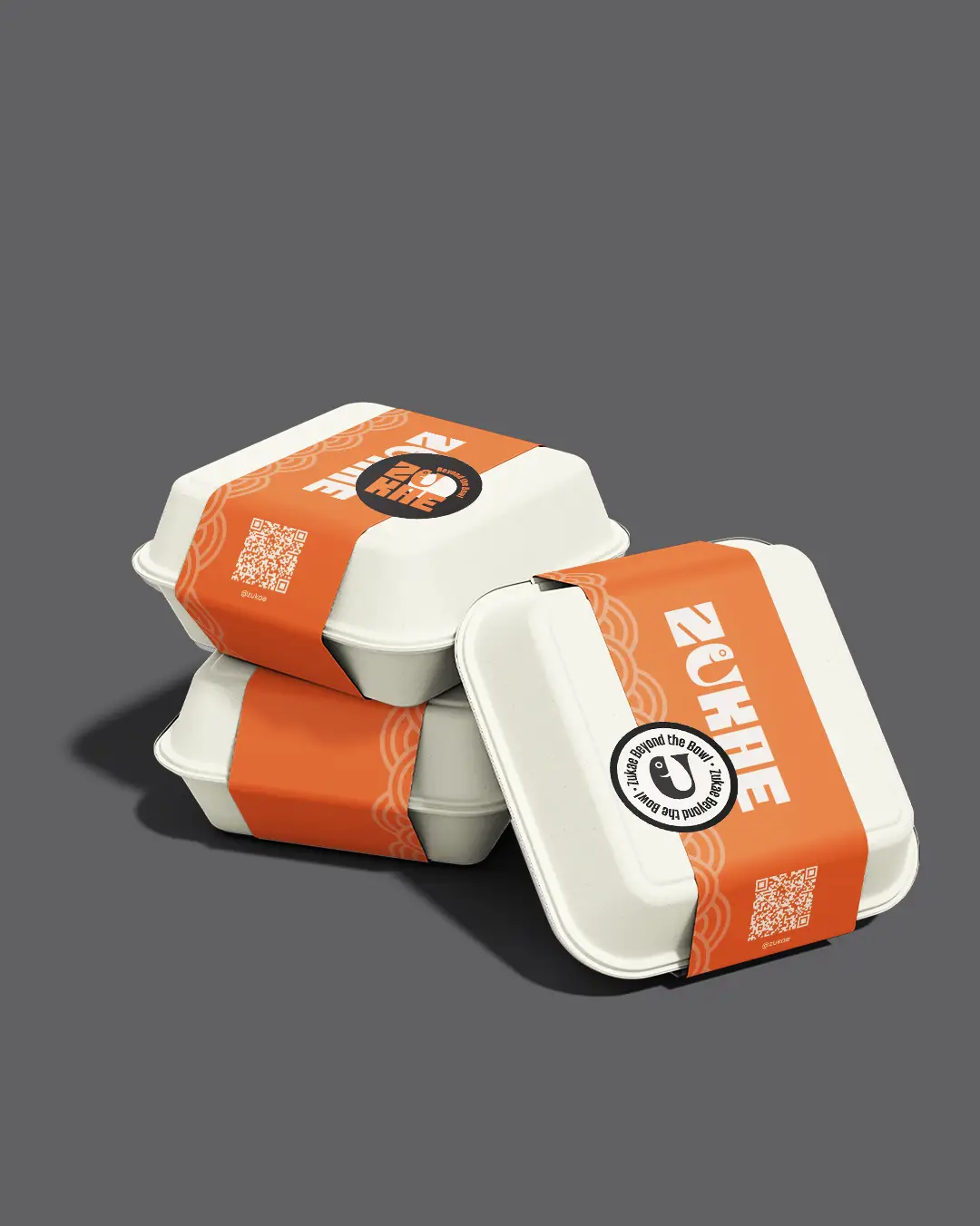
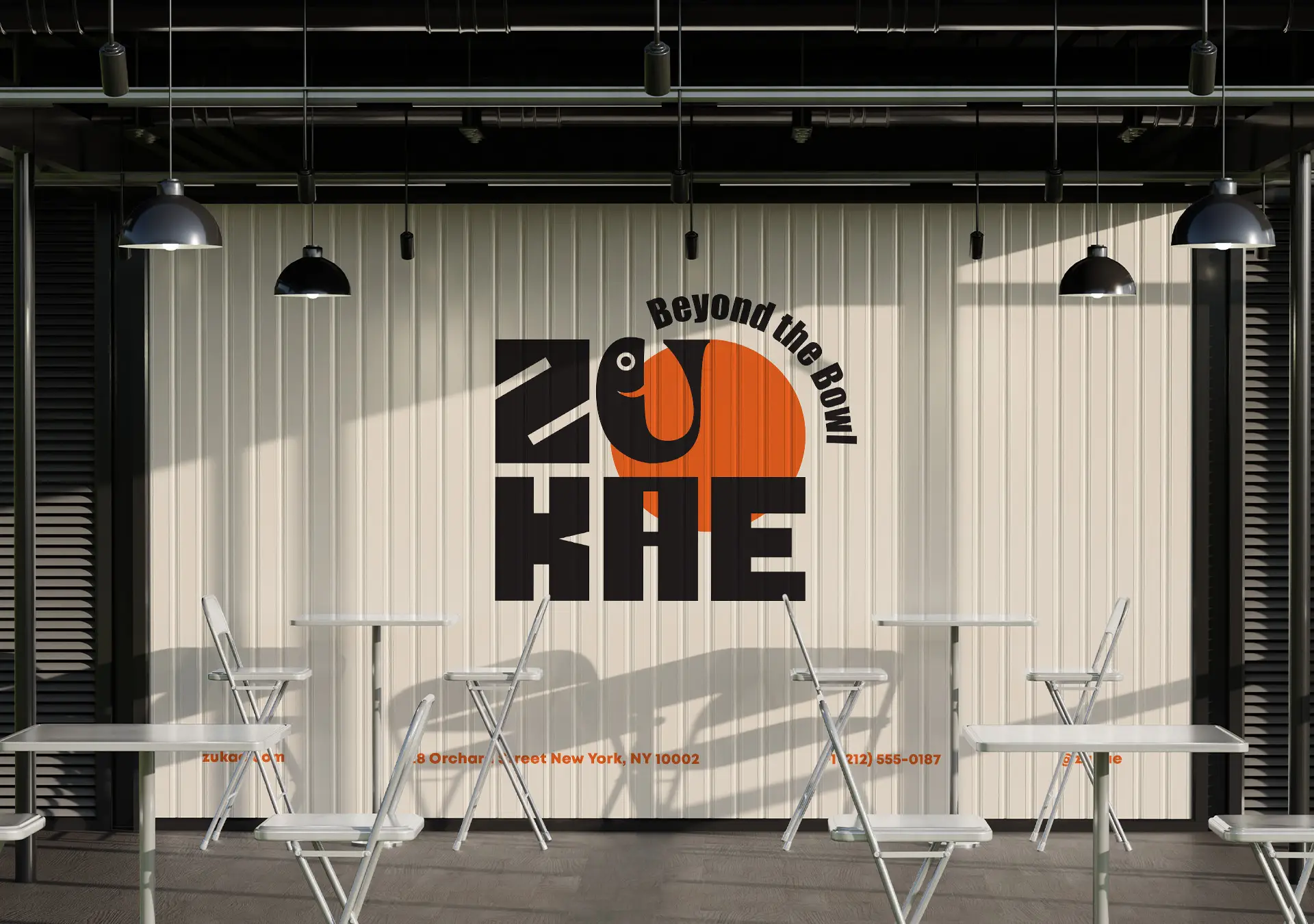
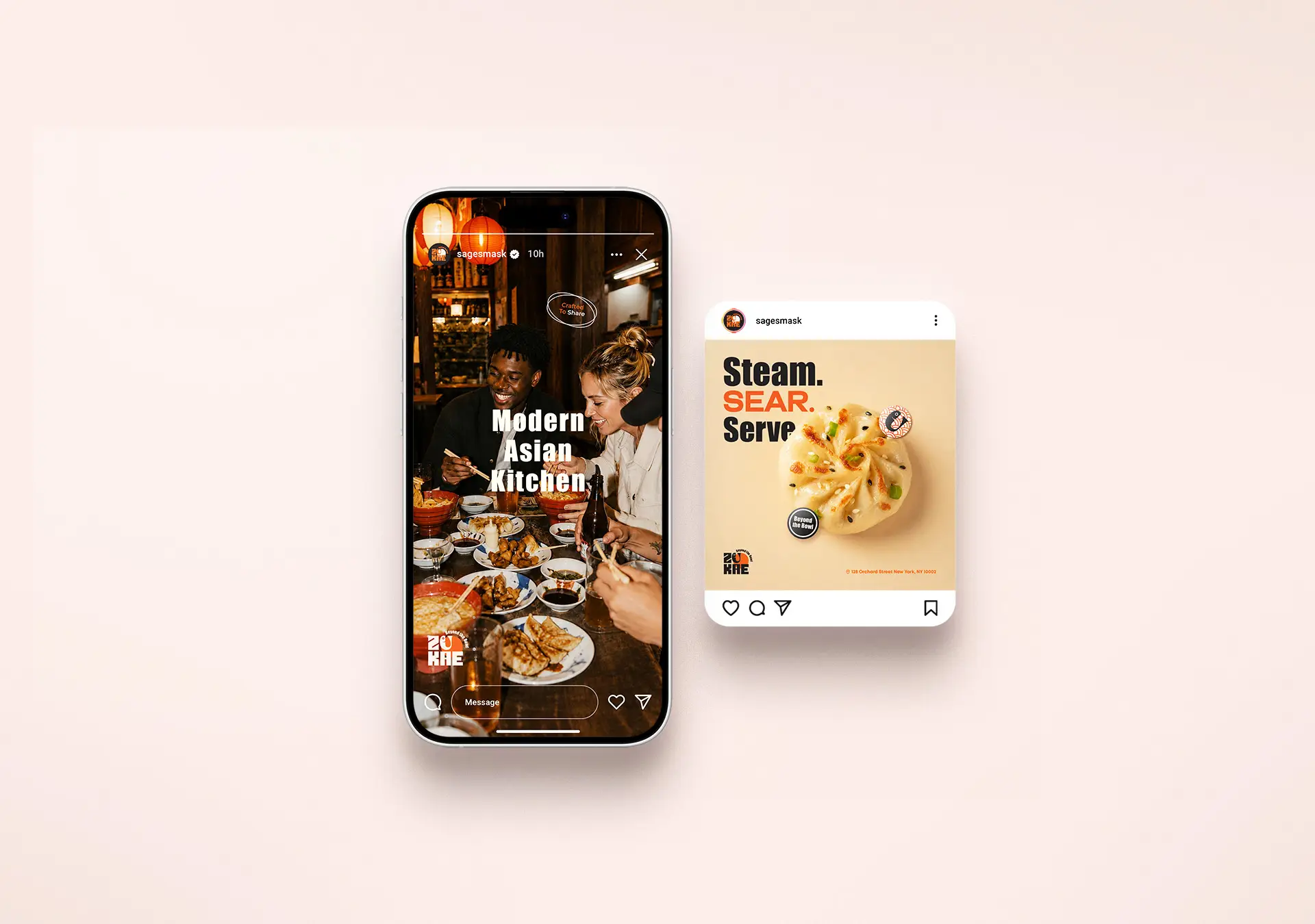
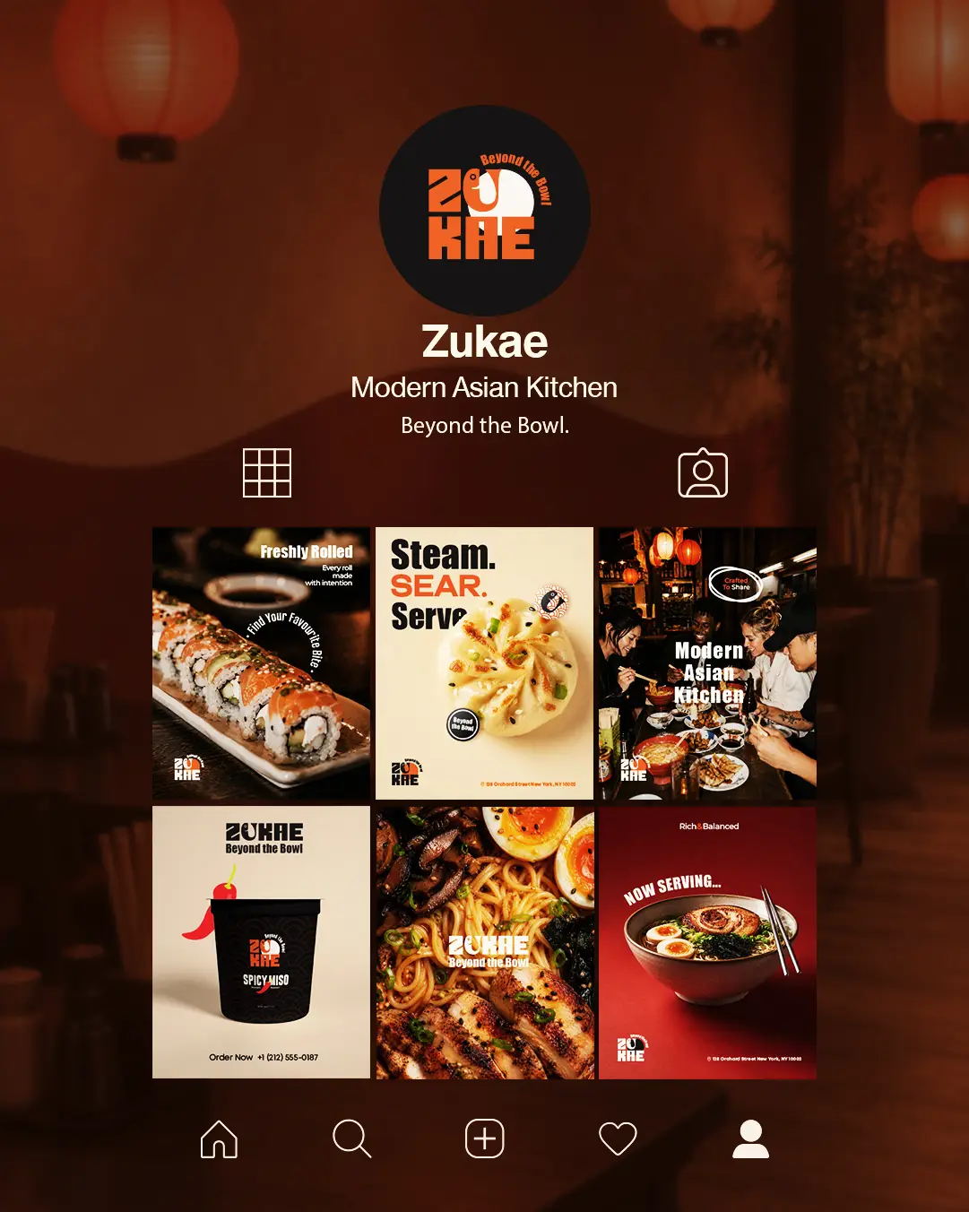
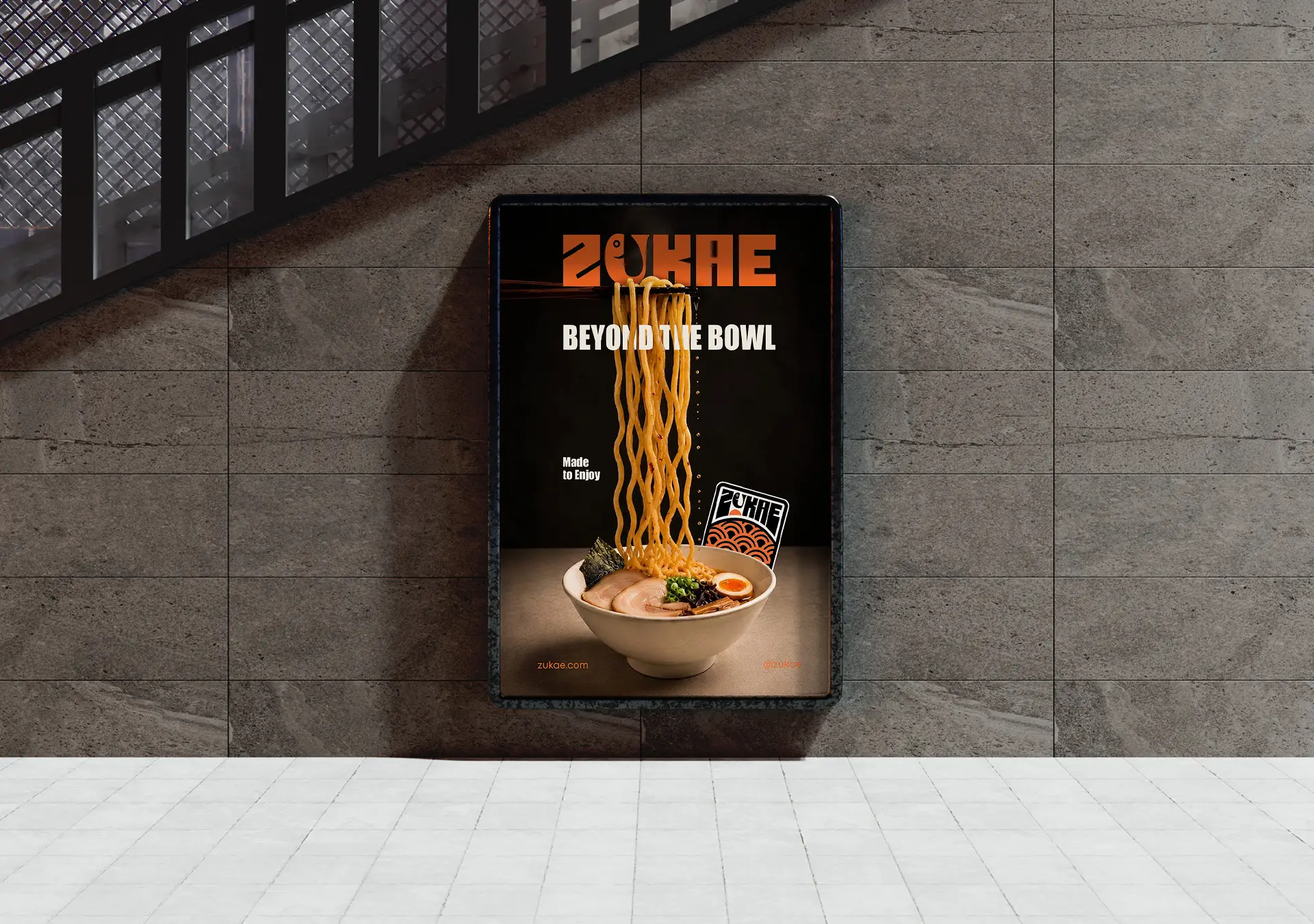
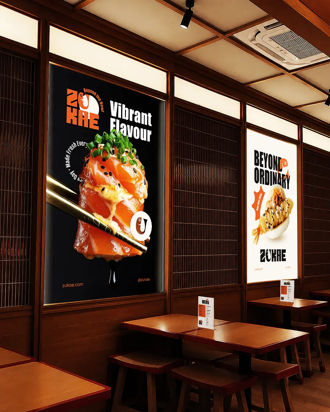
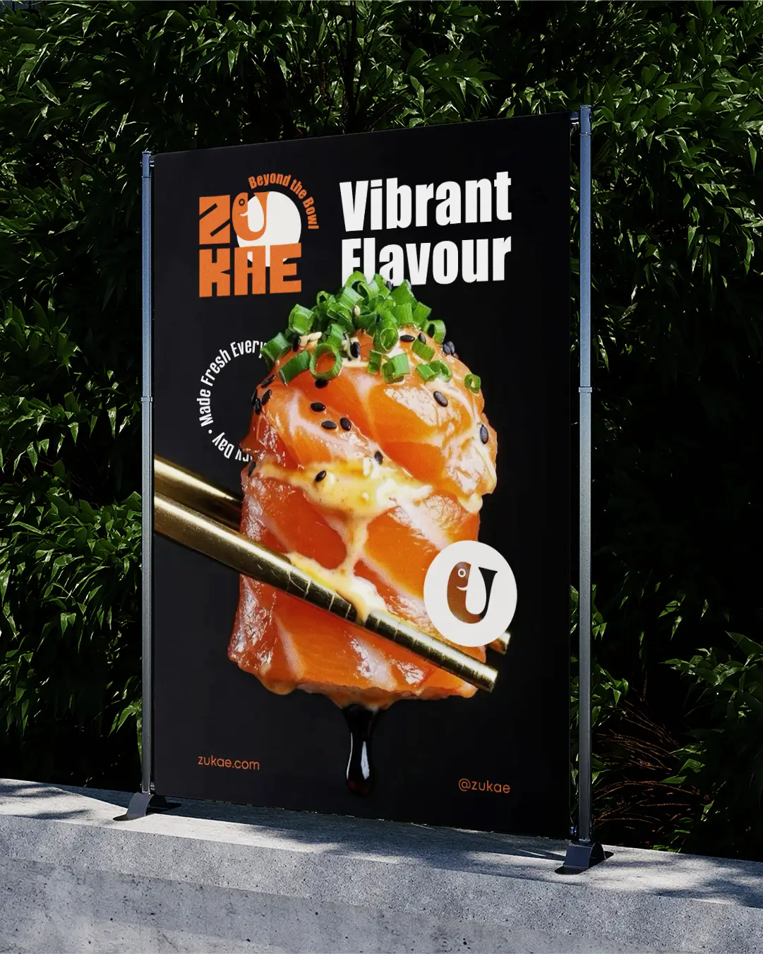
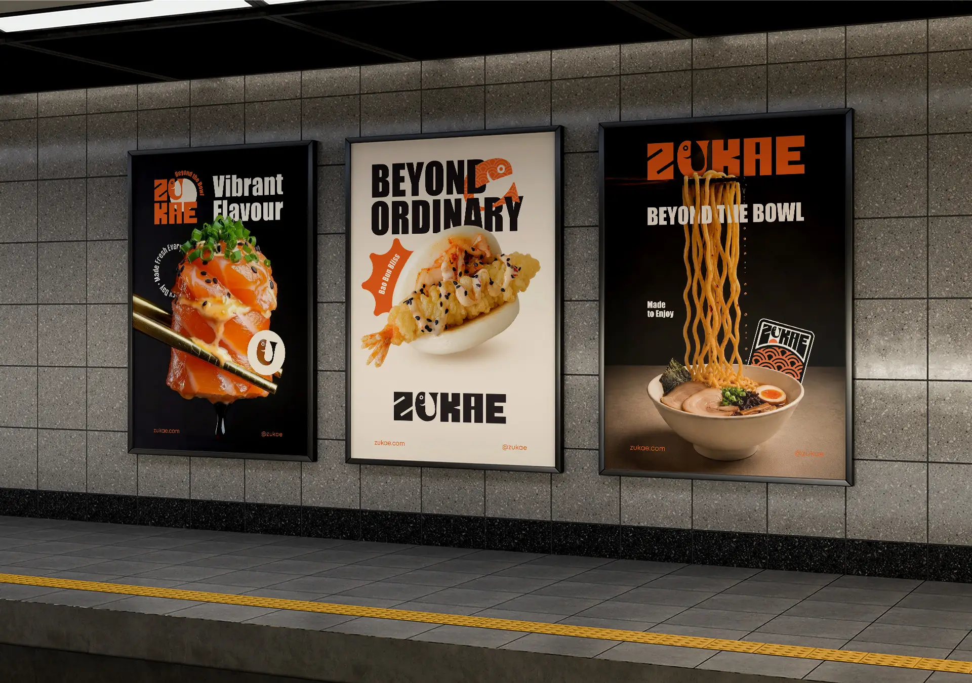
In the posters and social media, the identity is combined with striking food photography, large headlines, and bold compositions. The fish symbol, pattern, and typography reappear in different ways, allowing each application to have its own look while remaining instantly recognizable as ZUKAE. From the main packaging to the small stickers, all elements work as part of the same system. The result is a consistent, flexible, and distinctive identity, in which every detail connects with Asian cuisine and enhances the overall brand experience.