CUKI KIDS GAMES
BRAND IDENTITY / LOGO DESIGN / GAME PACKAGING / ILLUSTRATION / VISUAL COMMUNICATION / SOCIAL MEDIA DESIGN
Toy brand identity design / Logo design for a children’s toy / Packaging and memory card design / Illustration and social media design
Toy brand identity design
Logo design for a children’s toy
Packaging and memory card design
Illustration and social media design
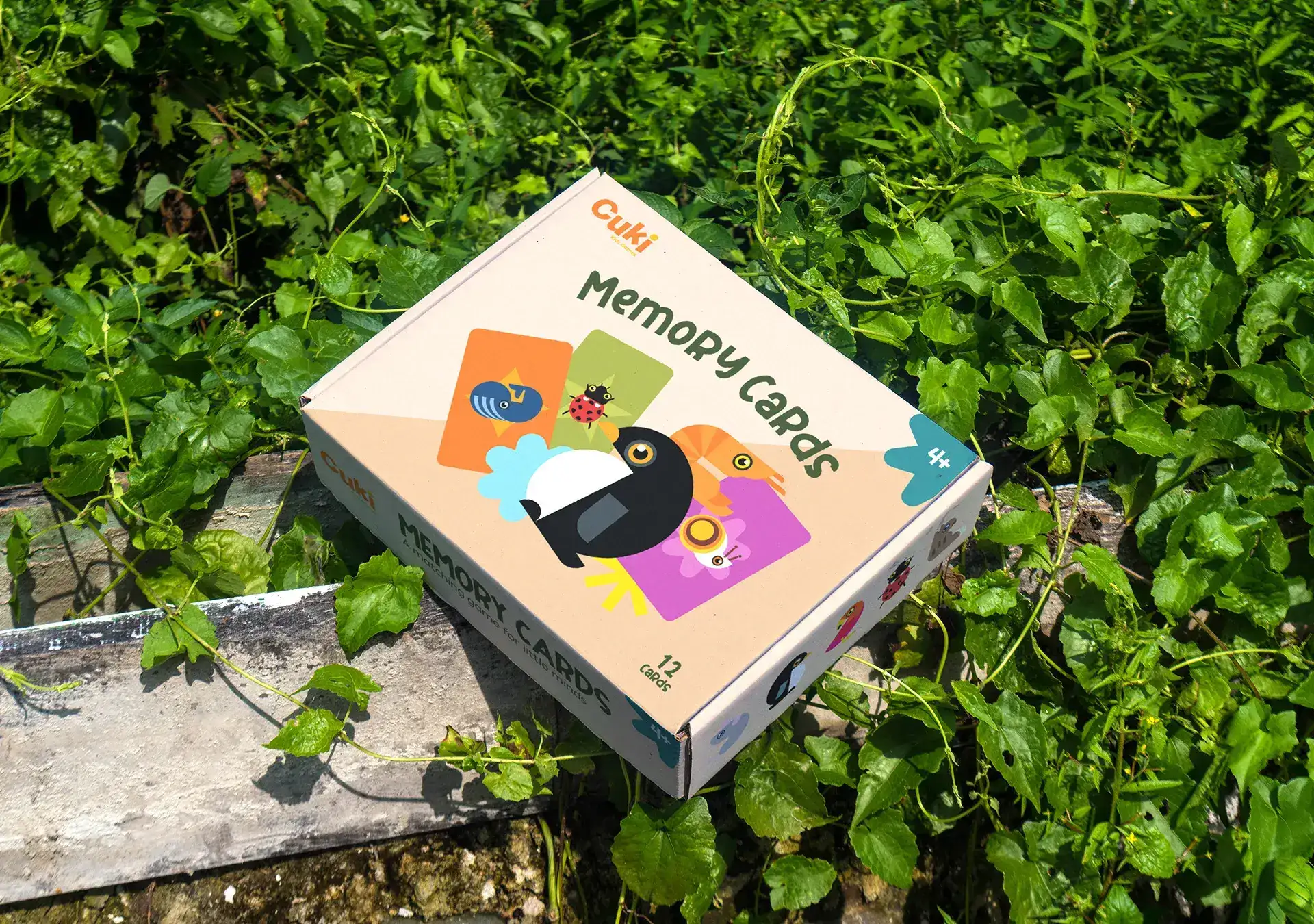
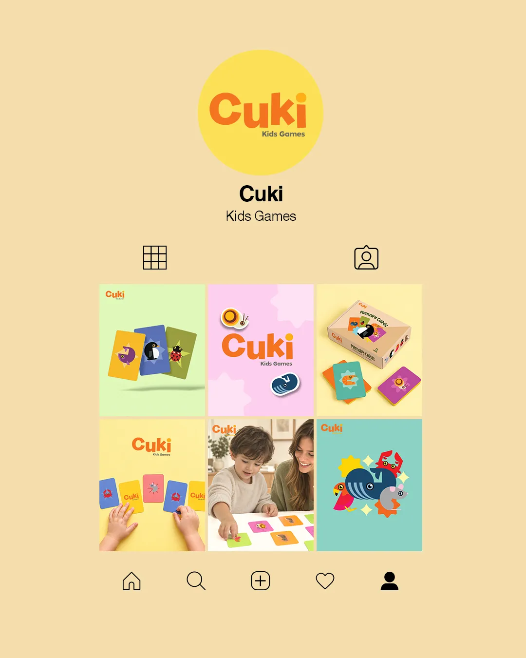
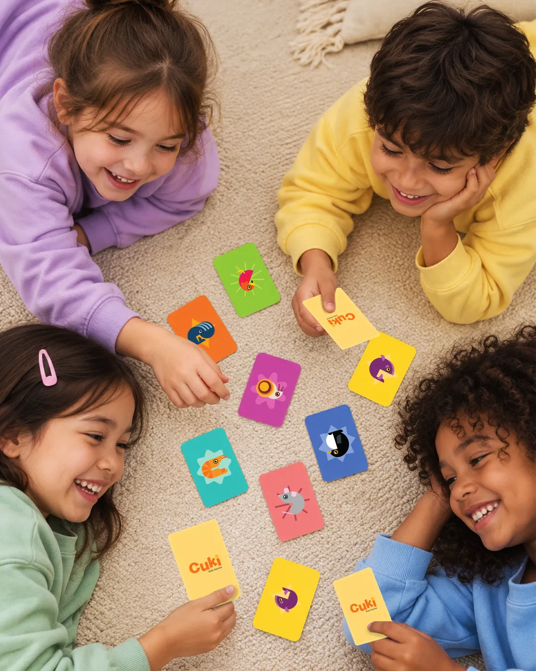
CUKI is a modern children’s toy brand created around color, geometry, and imagination. Its first game is based on memory cards featuring different animals, designed to be simple, cheerful, and easily recognizable by children.
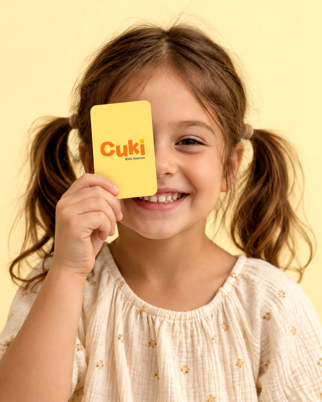

The brand identity was designed from scratch with the aim of giving it a distinctive character and making it stand apart from typical children’s toy packaging. The creative direction is bright and full of energy, while remaining clean and well-organized. This allows the brand to connect with children in a direct way, while maintaining a modern and carefully crafted visual identity.
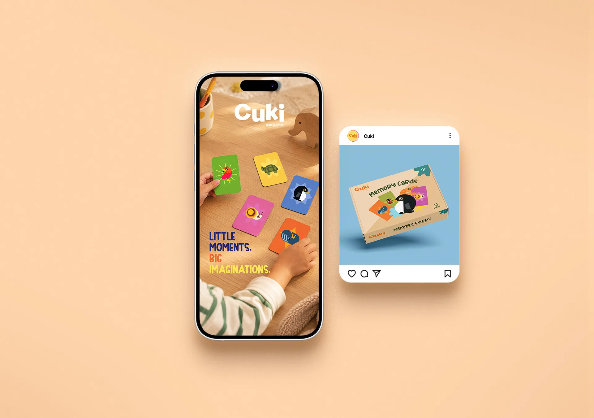
The name CUKI is short, simple, and playful. The logo features bold, rounded letters that create a friendly and warm feeling. The orange shade makes it stand out within the colorful palette, while its simple form ensures clarity both on the packaging and alongside the illustrations.
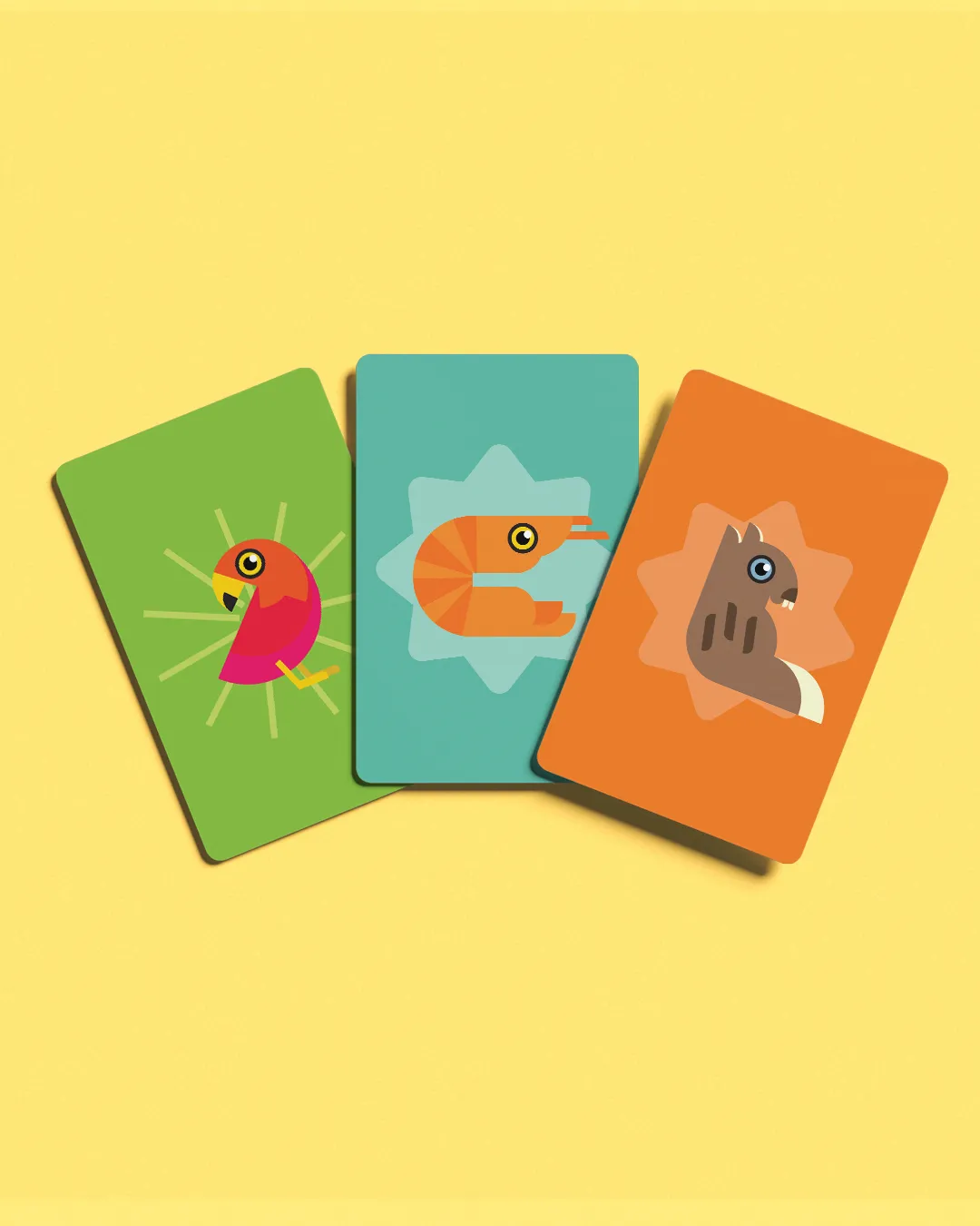
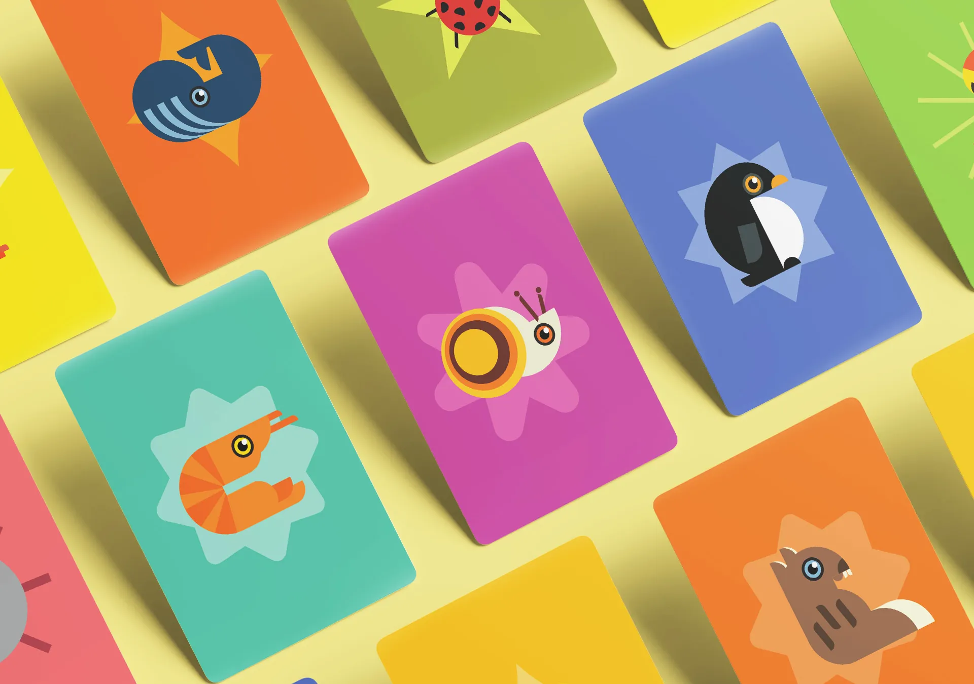
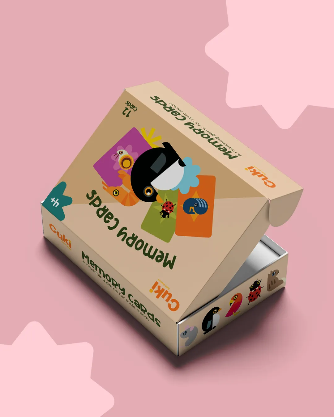
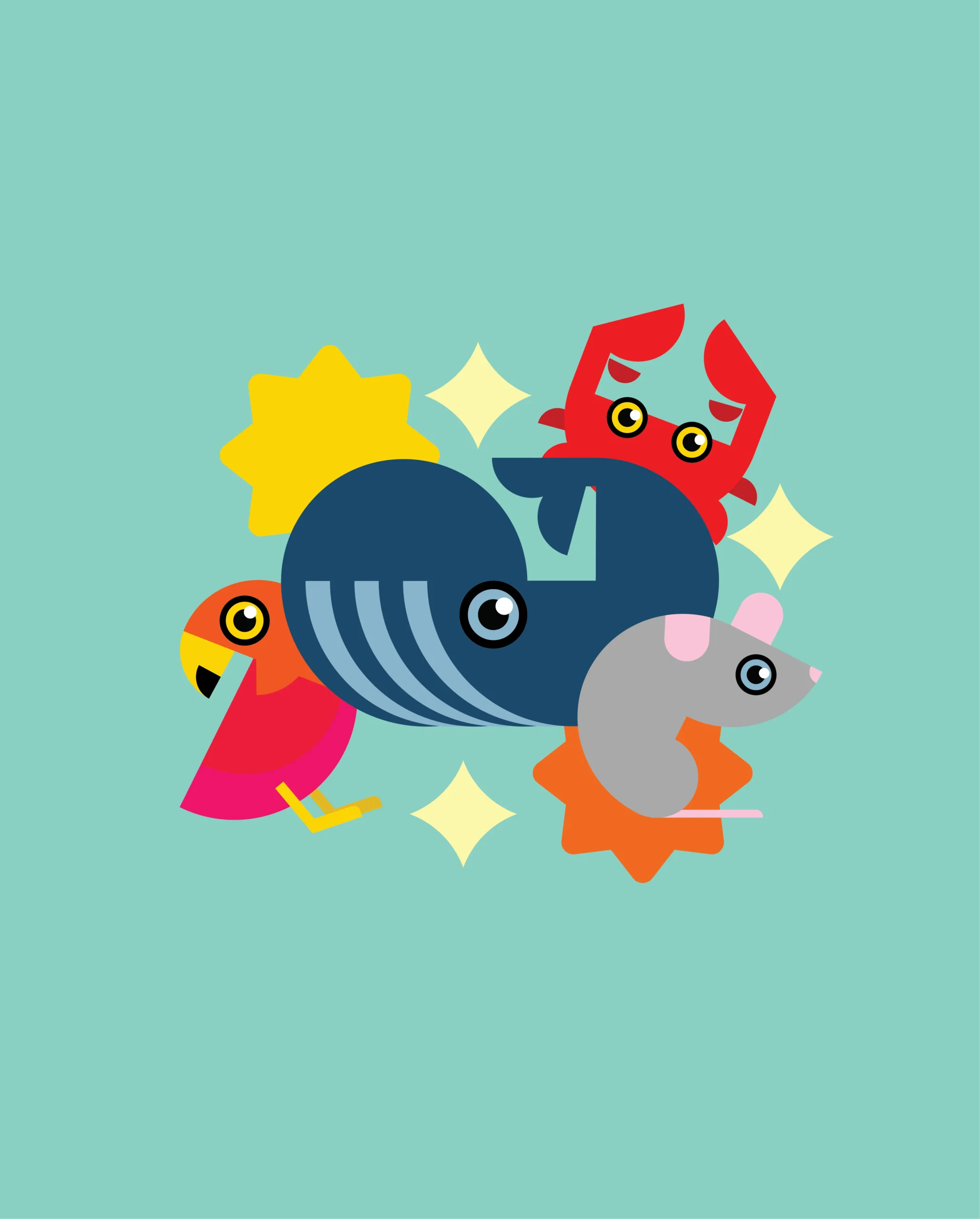
The creation of the animals is at the heart of the design. Each character was designed using simple geometric shapes, without ready-made graphic elements or a conventional cartoon aesthetic. Circles, curves, triangles, and small details come together to form different animals, each with its own expression and personality.
Although each character is different, they all follow the same design principles. The shared geometry, distinctive eyes, clean shapes, and bold color approach create a cohesive family. This allows children to easily recognize the illustrations while giving the brand a consistent and distinctive visual language.
The color palette includes orange, yellow, green, light blue, blue, pink, and purple. Each card features different color combinations to keep the game vibrant and engaging. However, the colors are not used randomly. They follow a consistent approach, connecting the cards, characters, and packaging into a complete visual system.
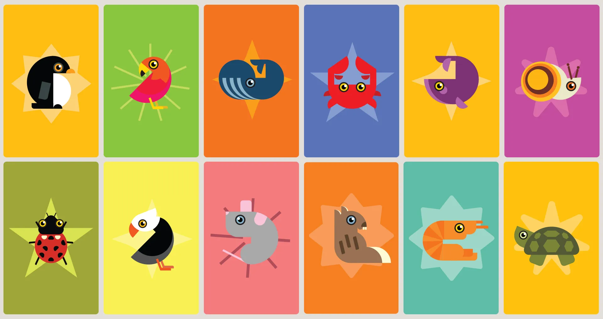
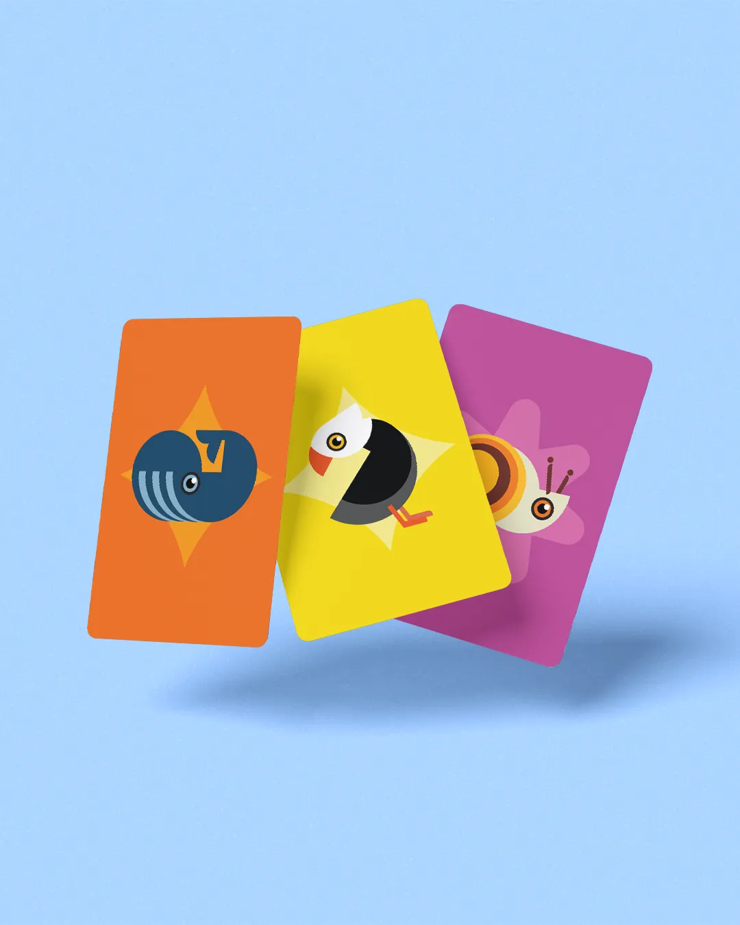

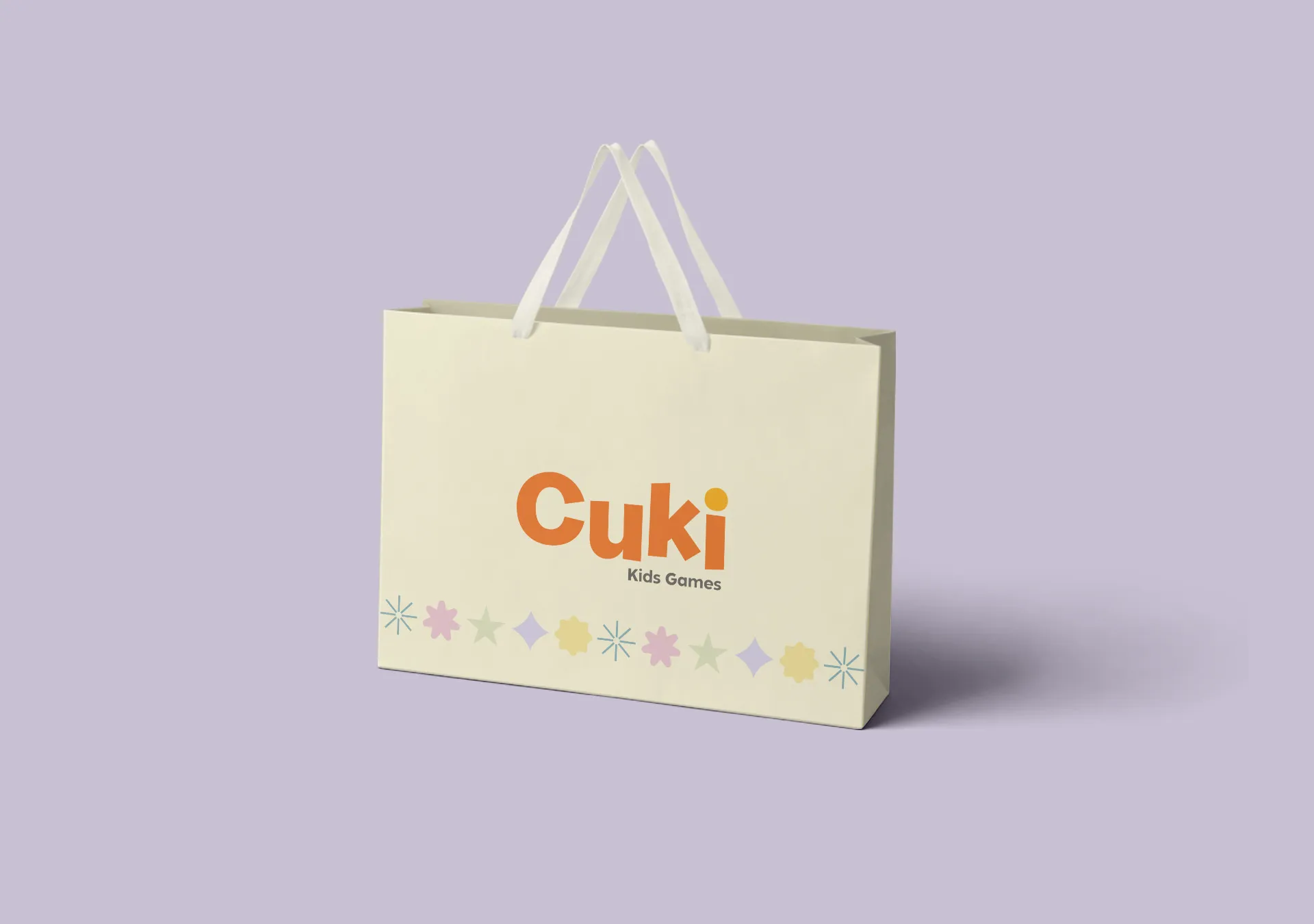
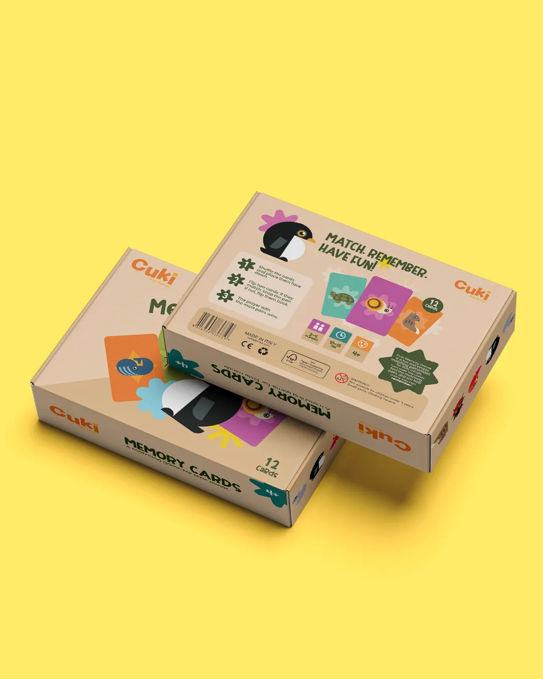
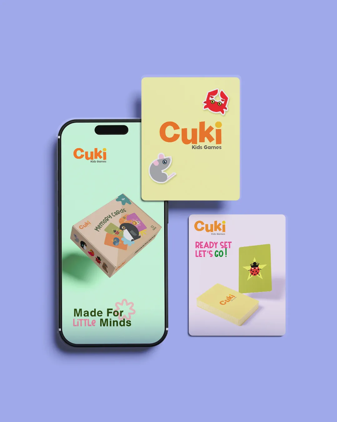
On the packaging, the characters take center stage. The more natural background shade balances the intensity of the colors and allows the illustrations to stand out without making the composition feel overcrowded. The information is clearly organized, allowing viewers to immediately understand what the product is and what it includes.
The result is a complete brand identity with a strong character, where the logo, geometric illustrations, colors, and packaging work together as a unified whole. CUKI transforms a simple memory game into a colorful world designed from scratch, with consistency, imagination, and its own distinctive personality.