AFTER
BRAND IDENTITY / LOGO DESIGN / PACKAGING DESIGN / POSTER DESIGN / VISUAL COMMUNICATION / SOCIAL MEDIA DESIGN / WEB DESIGN
Brand identity design for a beverage / Logo design for a beverage brand / Packaging and label design for a beverage / Poster and social media design for a beverage brand
Brand identity design for a beverage
Logo design for a beverage brand
Packaging and label design for a beverage
Poster and social media design for a beverage brand
AFTER is a contemporary sparkling aperitif brand built around the idea of moments that appear intensely and disappear quickly. Bubbles, light, reflections and movement became the starting point for a visual identity with a dynamic, youthful and more editorial character.
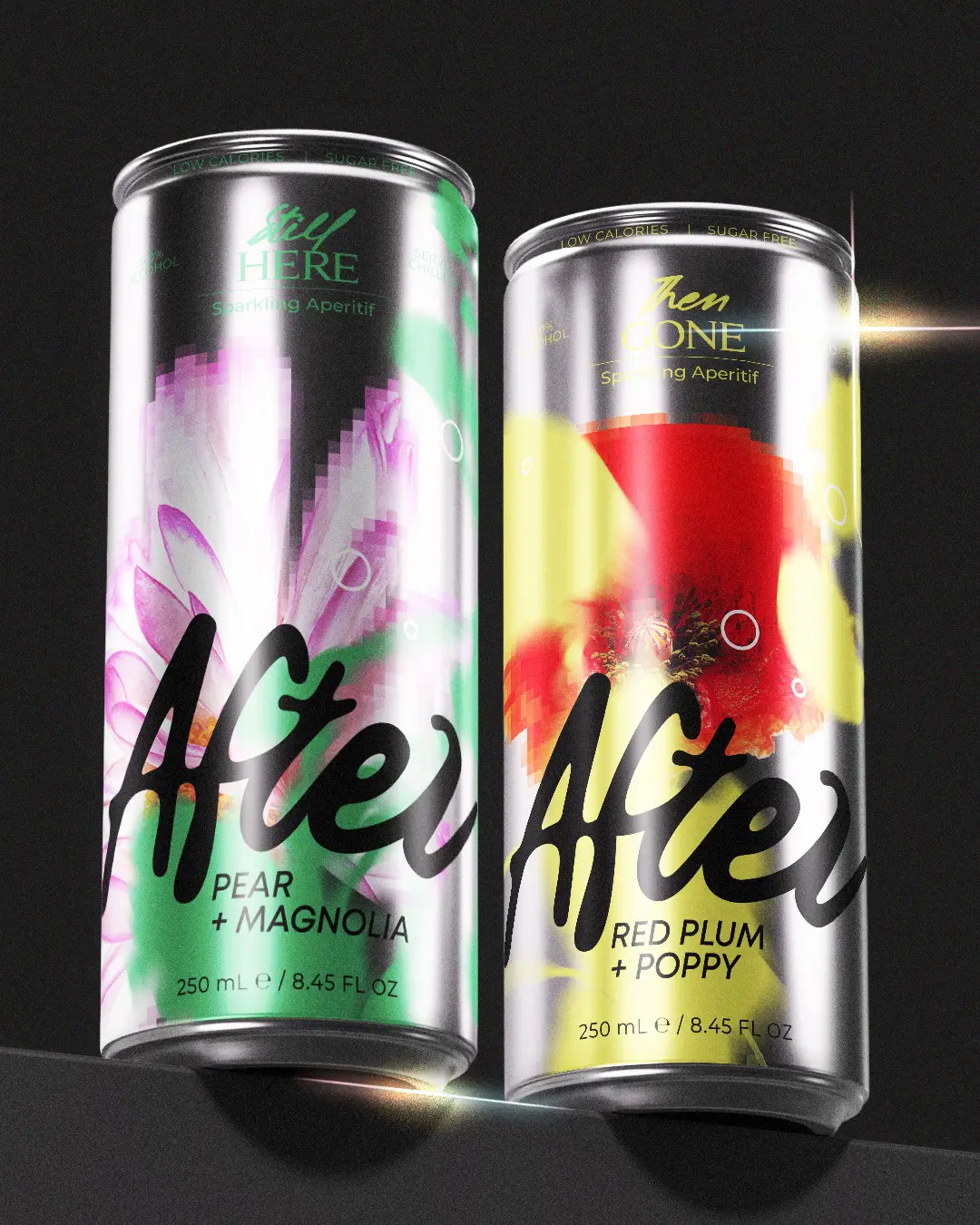
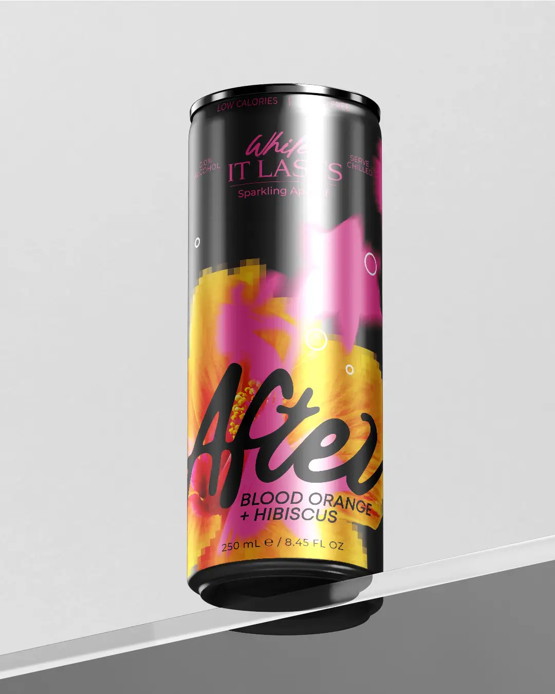
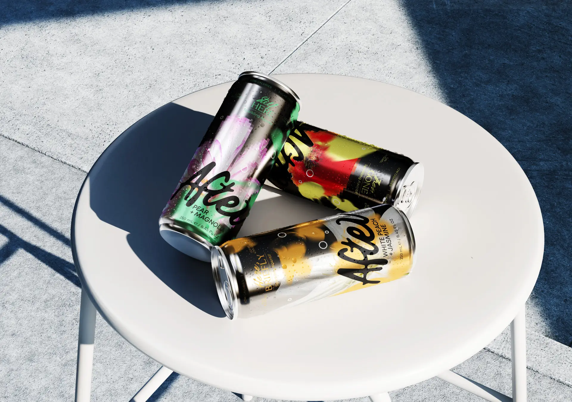
The brand identity was designed from the ground up with the aim of standing out from the more expected aesthetic of the category. The AFTER logo is based on a free, handwritten form with strong movement, which acts as the main recognizable element and is consistently carried across all applications. The cleaner secondary typography creates balance and helps the information remain easy to read.
A central role in the project is played by the packaging design. Each flavour has its own colour identity and floral element, while all packages follow a common design logic. The bold colour fields, organic forms and floral details create contrast with the metallic surface of the can and make each flavour immediately recognizable.
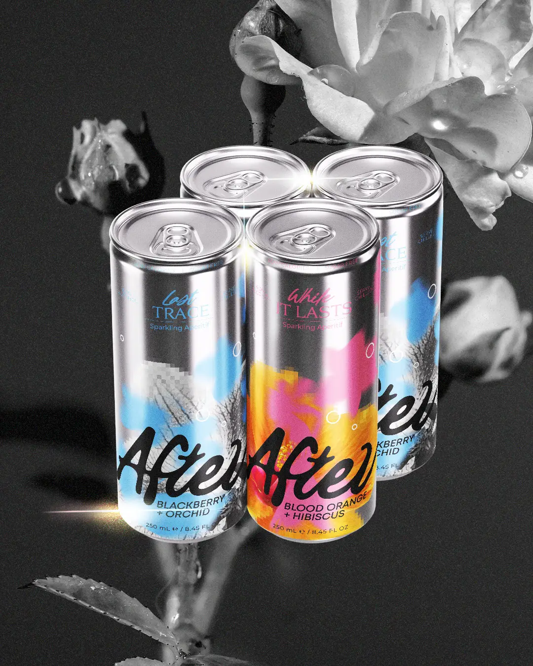
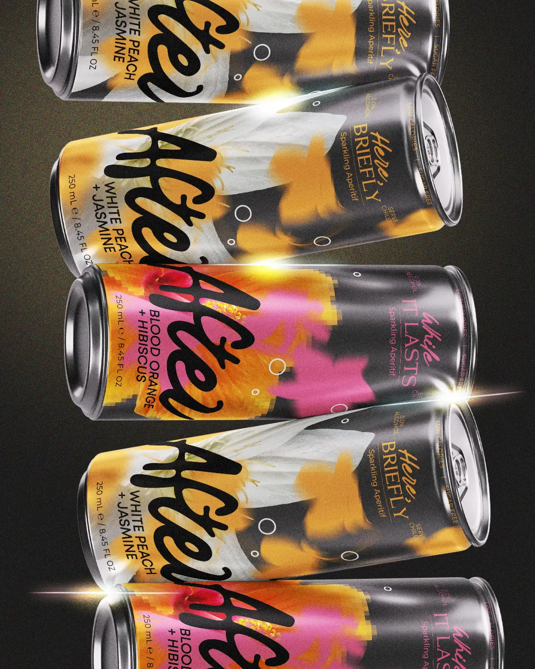
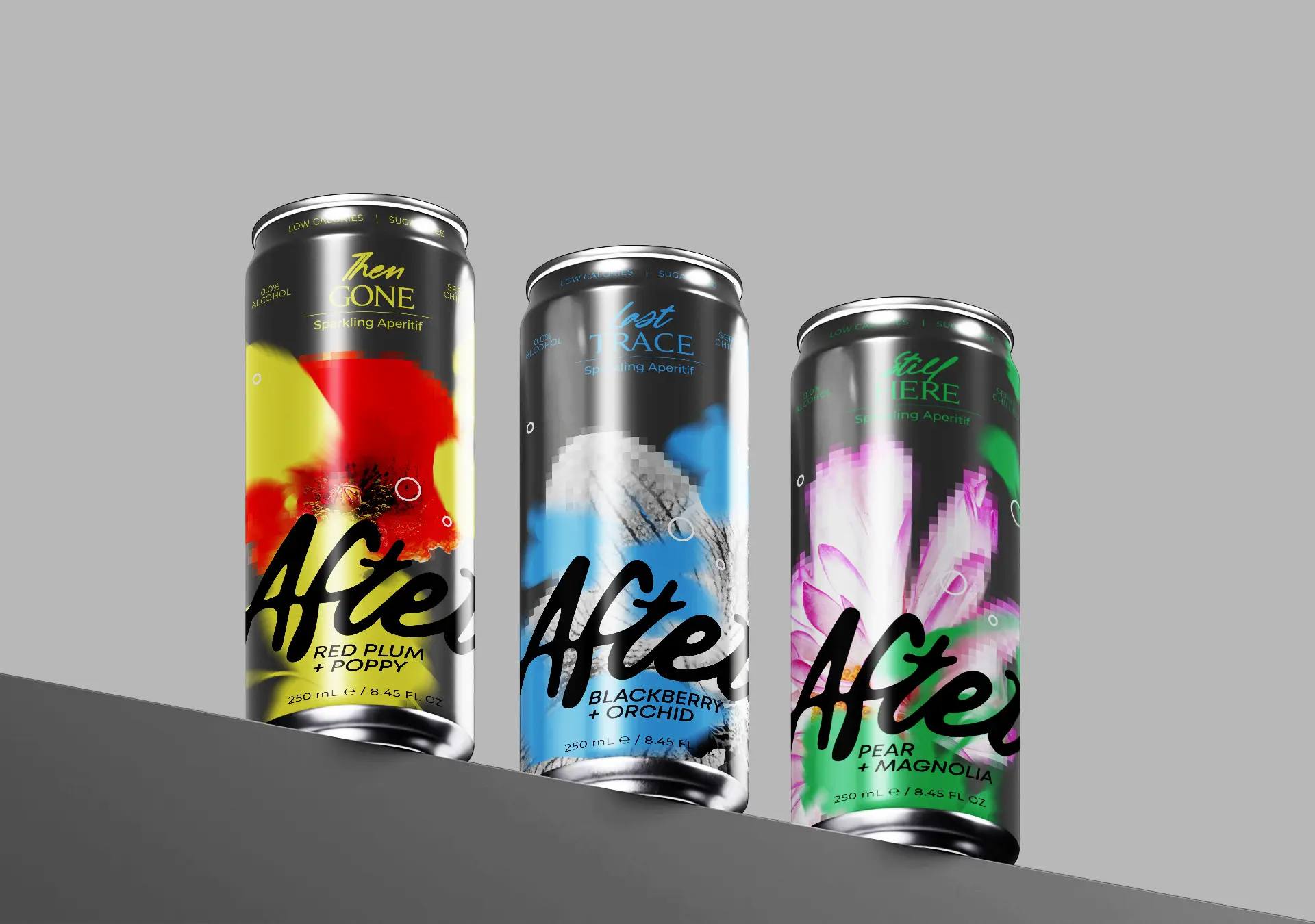
The large-scale logo acts as a common visual link across the entire range, while the typography and information are organized with a clear hierarchy so the design remains bold without becoming overloaded. The different colour approach of each flavour brings variety to the collection while maintaining brand consistency when the packages are presented together.
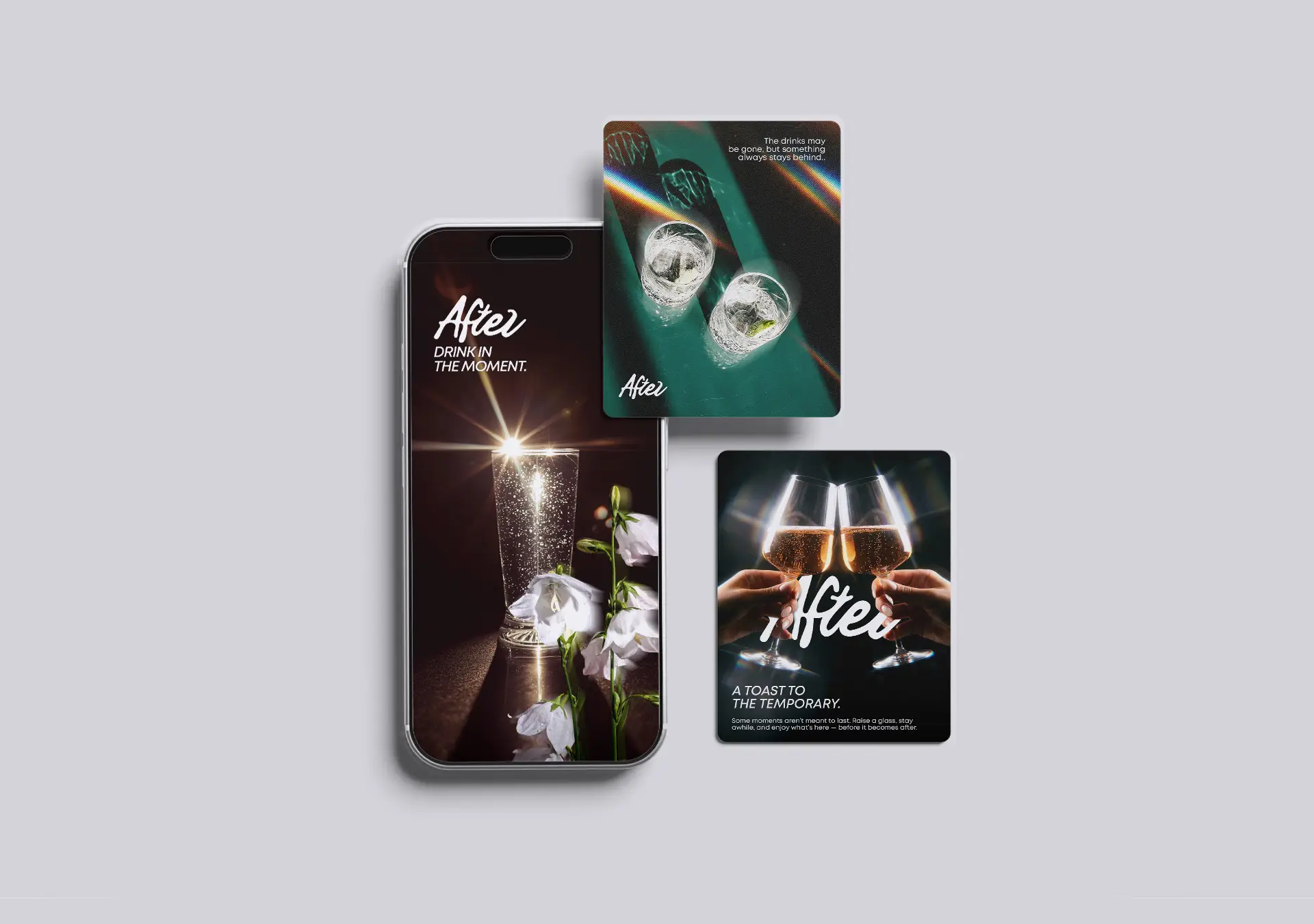
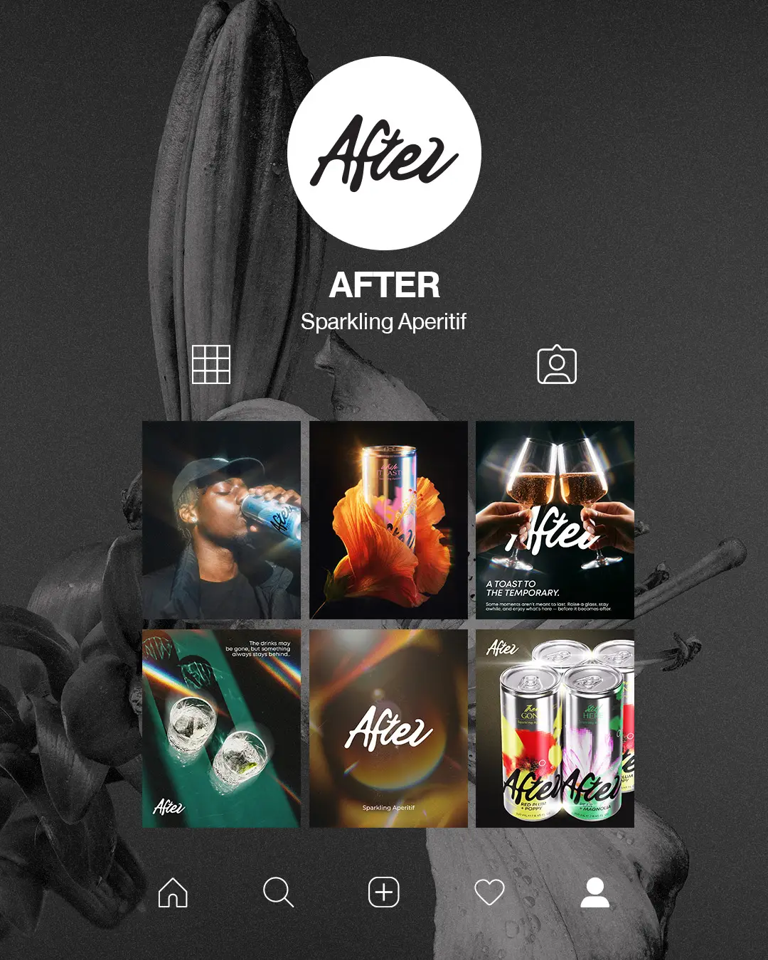
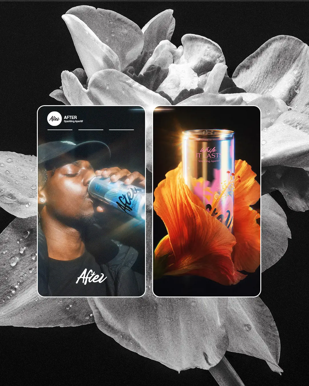
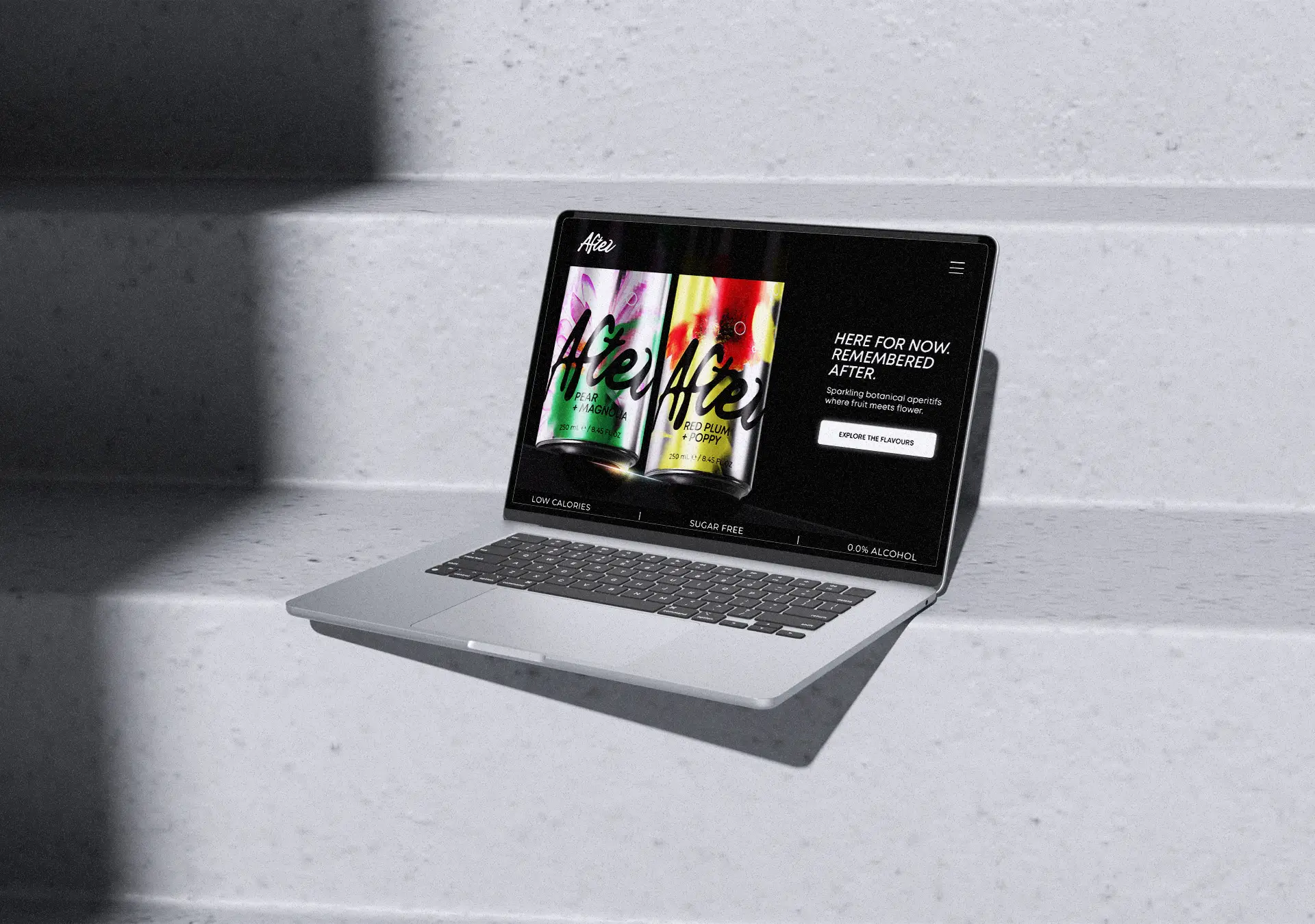
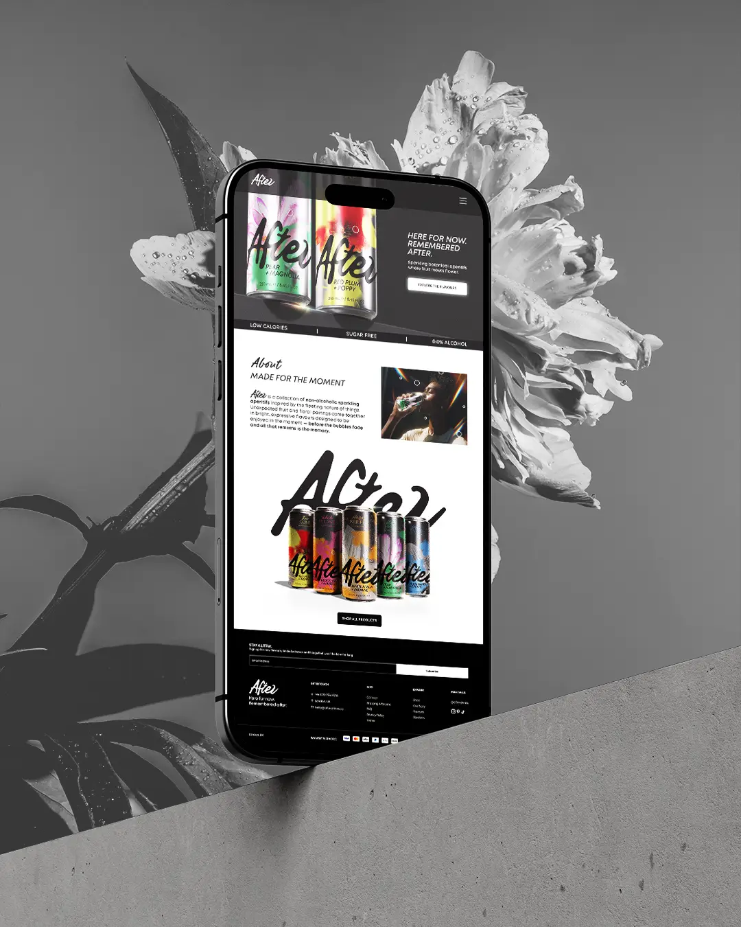
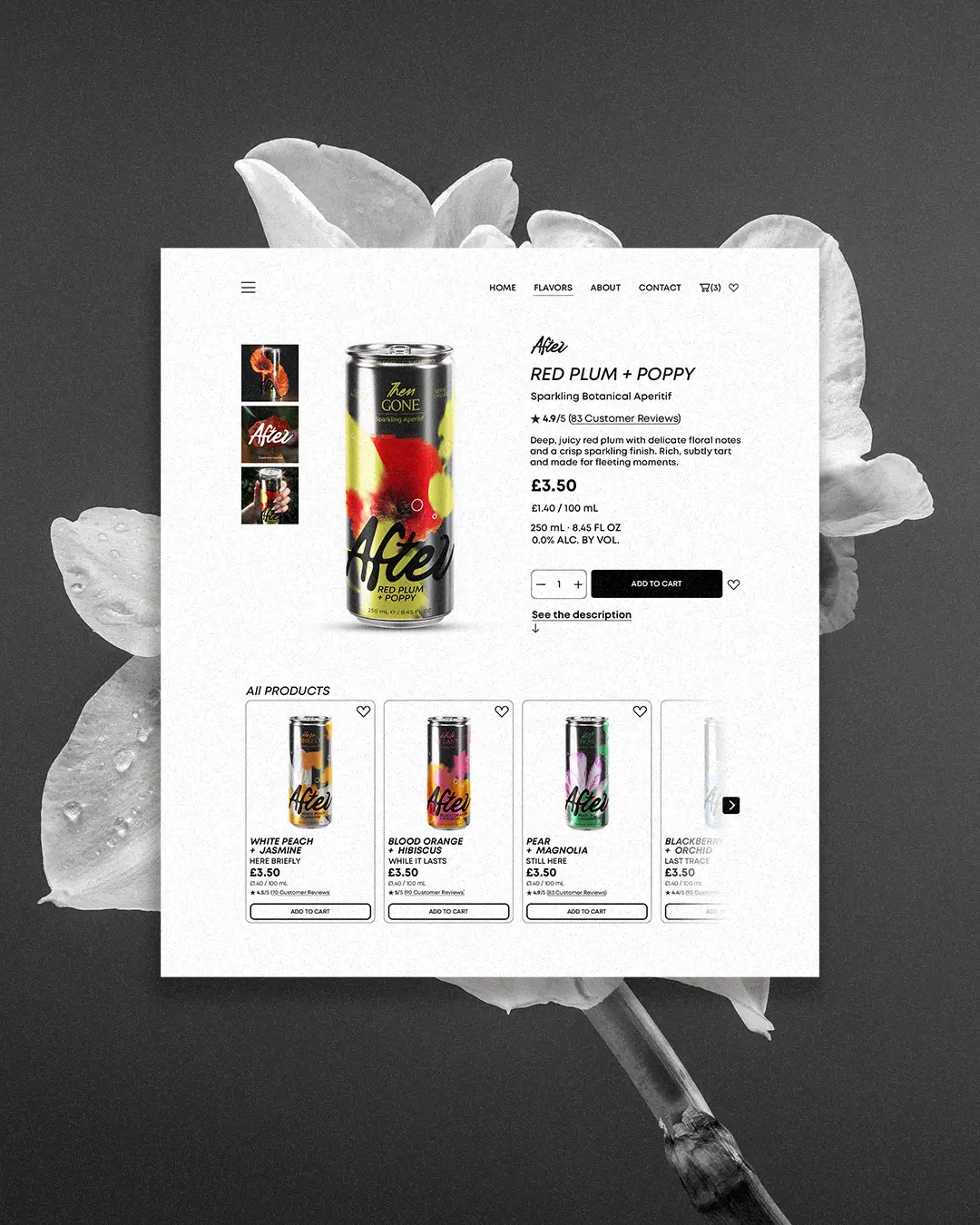
The same visual language extends across posters, social media and digital applications. The photographic direction is based on intense light, shadows, reflections and prismatic effects, creating an atmospheric campaign aesthetic that strengthens the character of the product. The posters make use of different scales, close-up imagery and bold compositions, ensuring that the packaging always remains the main focus.
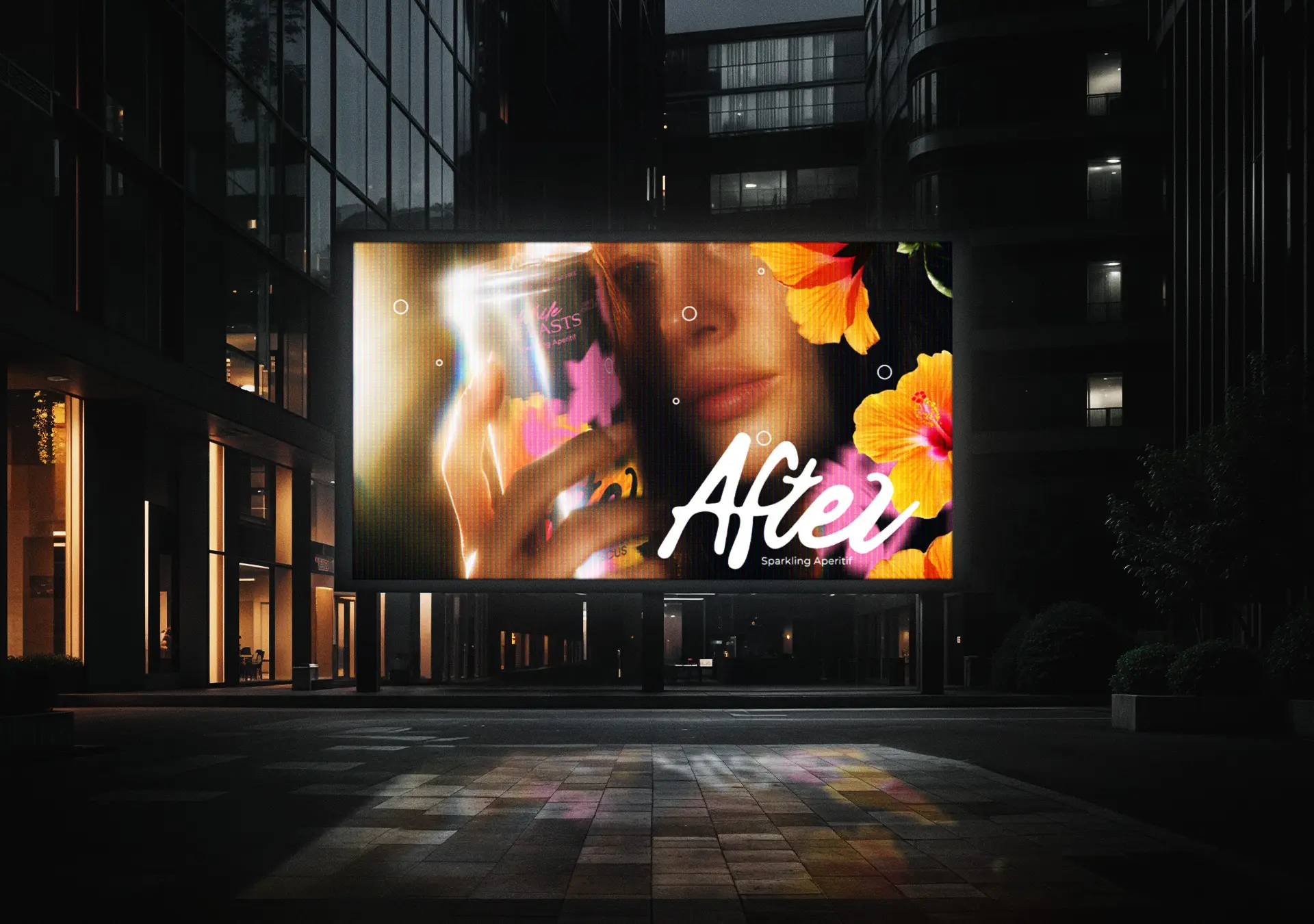
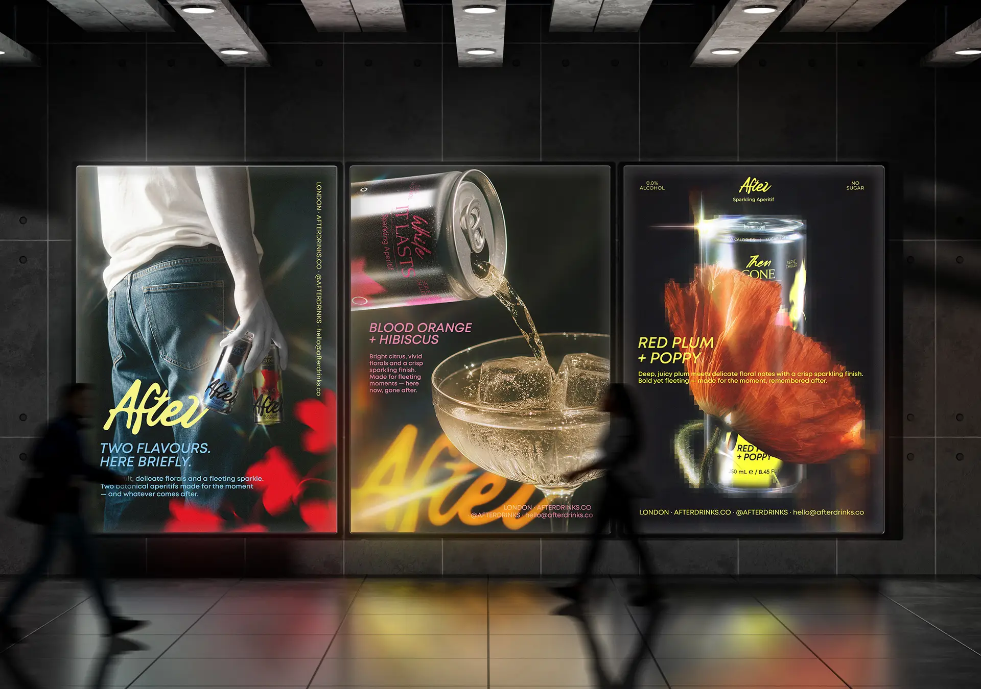
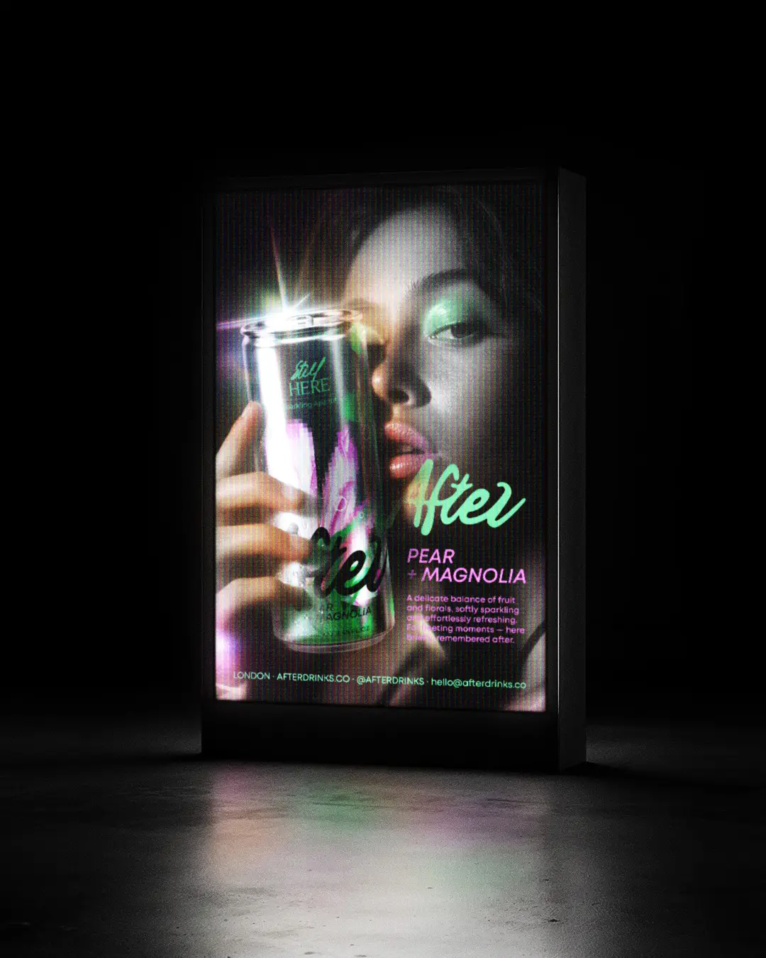
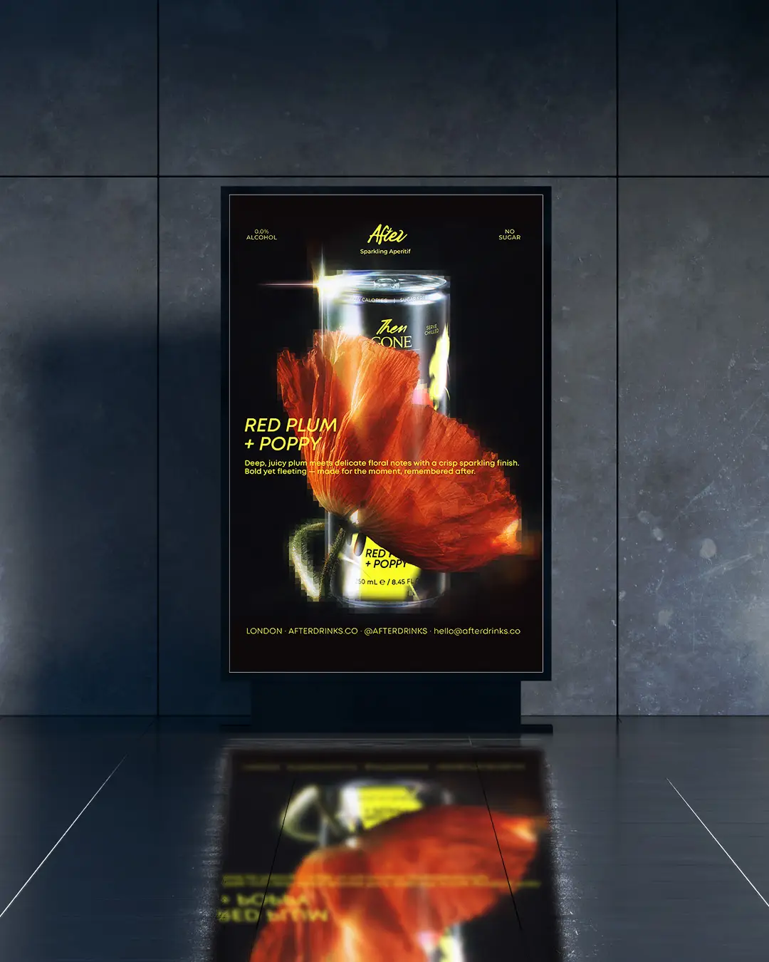
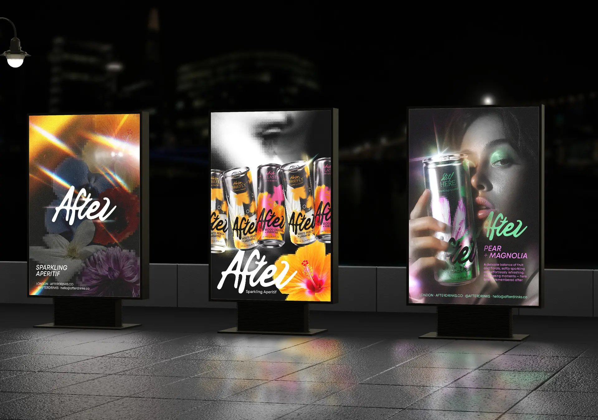
The result is a complete visual system in which the logo, packaging, photography, posters and digital applications work together as one cohesive whole, giving AFTER a distinctive, contemporary and instantly recognizable presence across every physical and digital touchpoint.