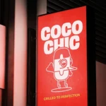
Luna Rossa
LOGO DESIGN / BRANDING / PACKAGING / PIZZA MENU
Pizzeria logo design / Pizza packaging design / Pizza branding / Pizzeria menu
Pizzeria Logo Design
Pizza Packaging Design
Pizza Branding
Pizzeria Menu


The Collaboration
The creative foundation of the project was the logo, which depicts, in a simple, charming, and entirely linear way, a hand holding a slice of pizza. The line is continuous, playful, and distinctly iconic, allowing the symbol to stand out and function seamlessly across various applications—from boxes and tags to social media and stickers. Paired with bold, slightly retro typography, the overall identity is recognizable, modern, and approachable.


Next, we designed a two-sided menu using a clean grid layout, focused on functionality and quick readability. The sections (Pizzas, Starters, Salads, Drinks) are separated by simple geometric shapes and laid out in a double single-column format, making them practical for in-store use as well as for delivery or online viewing.


Special attention was given to the packaging, where we designed three versions of the pizza box—not as alternative concepts, but as equal elements of the brand system. Each box features a different background and typographic composition (red, white, green), maintaining the same logo and aesthetic. This allows the store to print and use all three interchangeably, depending on the order type, season, or target audience. In this way, the branding remains cohesive while gaining energy and flexibility through variation.


This project is a study in balancing a friendly, relaxed tone with a structured visual identity. The result is a brand with a clear voice and character, one that can stand out in the casual dining market, both locally and internationally.